Paolo Fontana / signaletic · Jonathan Monk
Visual identity
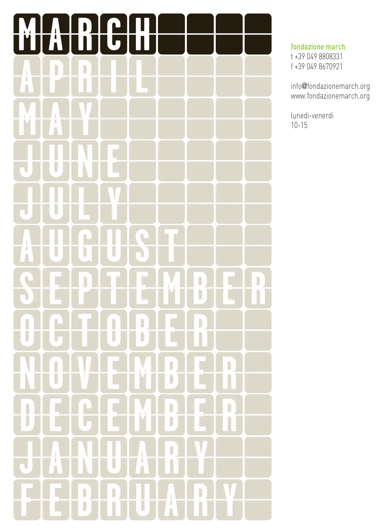
A name that changes every month and a sign that stays: the split-flap tile of a station departure board.
foundation for contemporary art
Designing the visual identity for a project as broad and ambitious as fondazione march was, for the studio signaletic, a chance to fine-tune choices along a path that was getting ever closer to the world of culture. The story of the brand follows the birth of the foundation and grows with it.
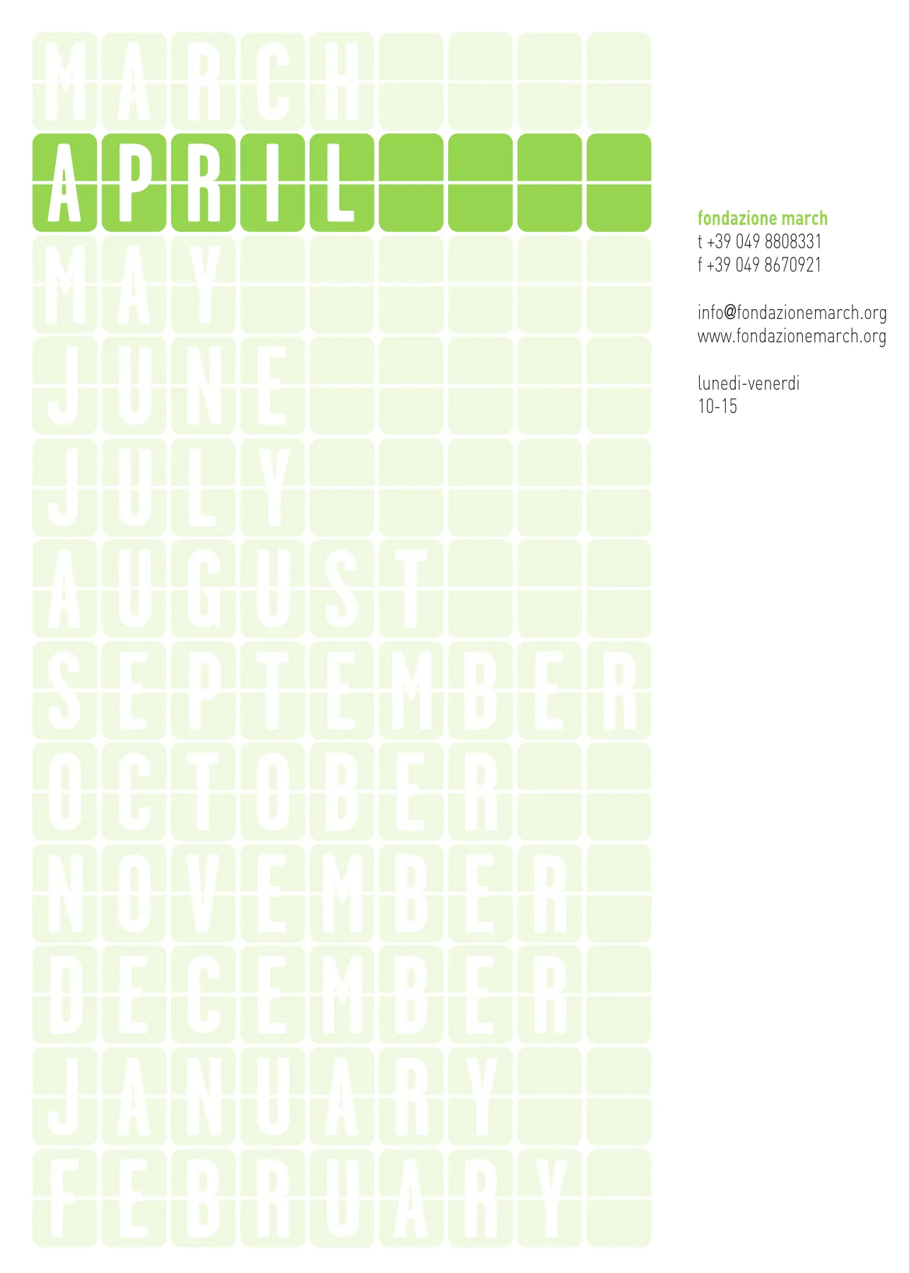
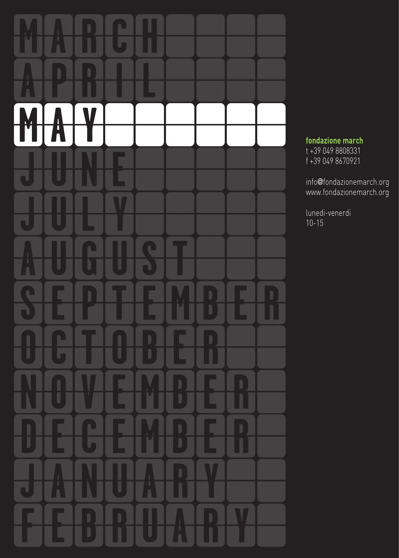
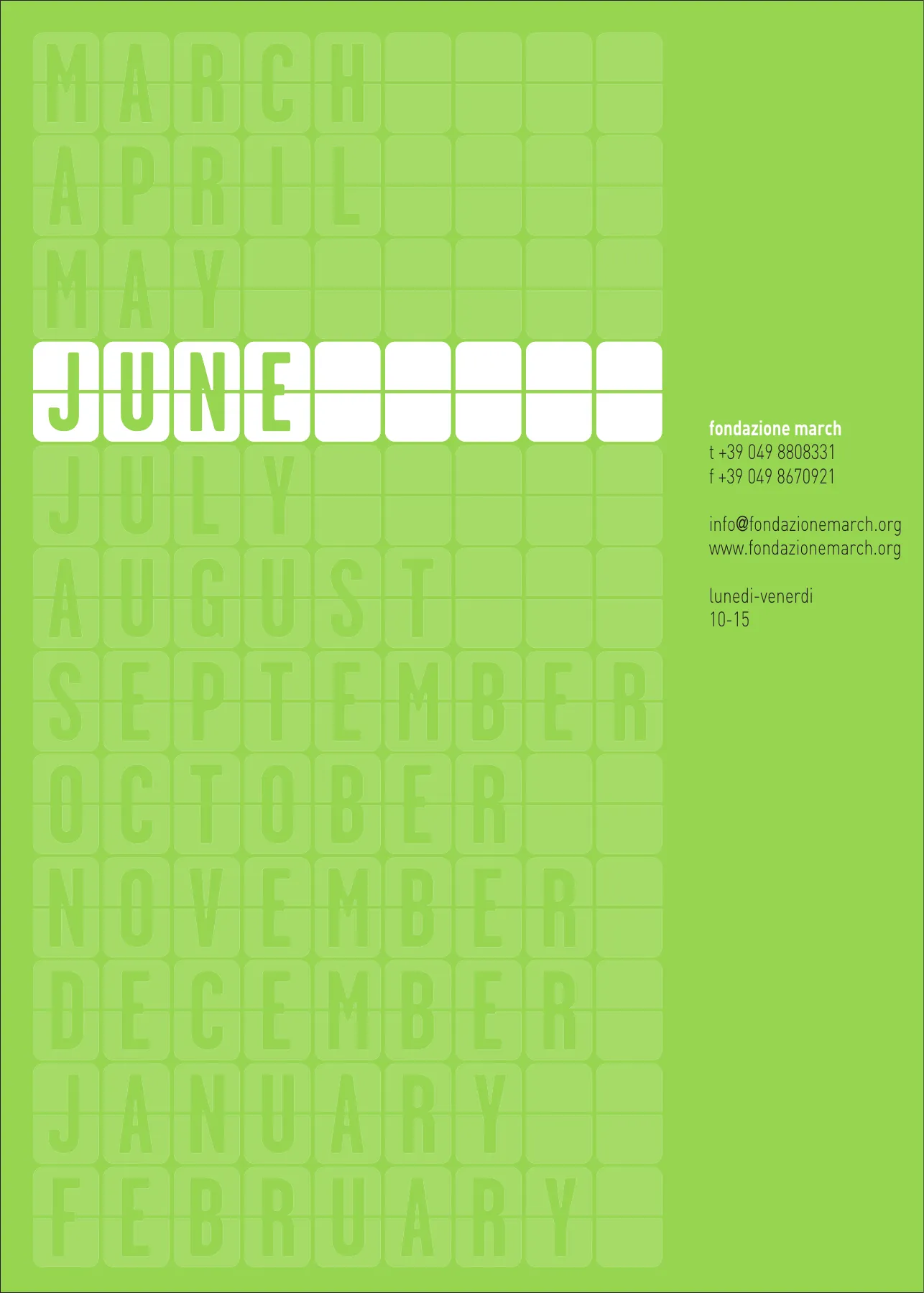
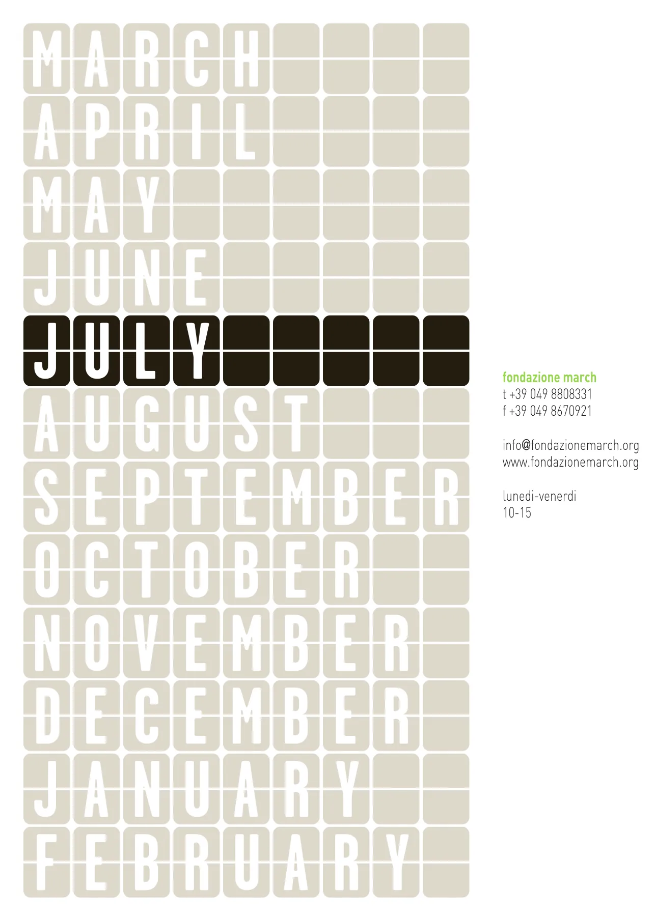
The idea of change called for an element that would remain recognisable as the months go by. By adopting a sign – the split-flap tile of railway departure boards – the logotype and the whole coordinated image were defined without creating a separate mark. The flaps turning with the months guarantee variability and mobility; the permanent wording restores balance after the disorientation created by Jonathan Monk’s idea.
Jonathan Monk and the naming
In September 2006 Silvia Ferri wrote to Jonathan Monk (Leicester, 1969; lives in Berlin), inviting him to create the foundation’s image together with the studio signaletic. His first reply came from Naples, after three hundred unanswered emails: “the first idea would be to call the space March”. March: the month planned for the founding deed.
The name would change with the month, to stress the work-in-progress nature of the foundation. Weeks of proposals followed – a legal problem with the word “fondazione”, a “Jonathan Monk Foundation”, a “January 15th Foundation”, a February that is “not 100% constant” because of the leap year – until the solution: the foundation is called march and, during the year, takes the name of the passing months.
The correspondence
Excerpts from the email exchange between Silvia Ferri and Jonathan Monk, September 2006 – March 2007.
Da: jonathan monkA: silvia ferri
sonia mentioned your foundation idea to me and I like it a lot
although my time is somewhat short
ideas are found somehow either way
the first idea would be to call the space MarchDa: silvia ferriA: jonathan monk
The changing months foundation: March foundation, April foundation, May Foundation….
we can use a stamp for the visual identityDa: silvia ferriA: jonathan monk
speaking about the month’s idea we discovered that using your proposal we have a legal problem, it’s impossible to register the word ‘fondazione’ as a part of the name of the foundation.
Da: jonathan monkA: silvia ferri
I was thinking about all the artist foundations that have appeared in recent years… even for artists who are still alive
perhaps you could call the foundation
Jonathan Monk FoundationDa: jonathan monkA: silvia ferri
could it be called ?
January 15th Foundation
more will be addedDa: jonathan monkA: silvia ferri
I am still in favour of the changing months idea…
and one month that is not 100% constant is February…
the leap year adding one extra day in 2008Da: silvia ferriA: jonathan monk
we call the foundation “March”, that will be the month of the birth of the foundation […] but we change the name of the foundation every month and we can use a stamp for all the documents.
Da: jonathan monkA: silvia ferri
great...
march makes me very happy
and the changing names or extra names even more
march april may june july august september october november december january february etcDa: jonathan monkA: silvia ferri
I really like the idea of a black building
I was thinking it would be good to write MARCH on a small billboard high up on the exterior wall. It should then be over pasted with the months that follow…
at the end of 12 months all should be removed to show MARCH again
and you would be left with a Mimmo Rotella like paper workDa: silvia ferriA: jonathan monk
Fondazione March is officially born. WOW!
The 12 logotypes
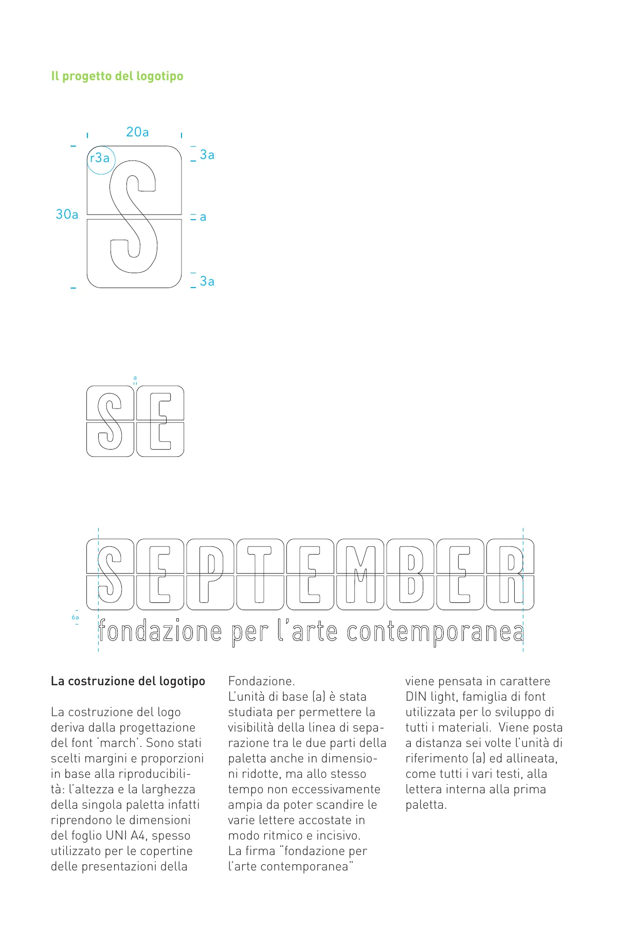
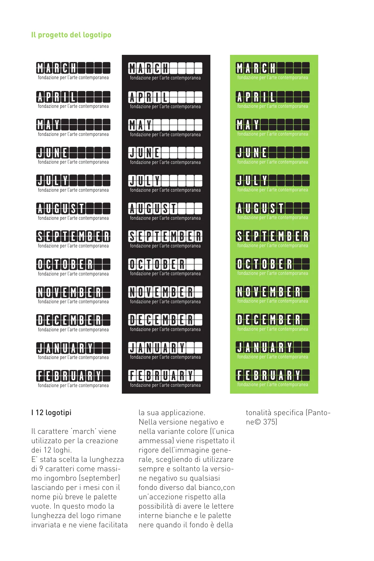
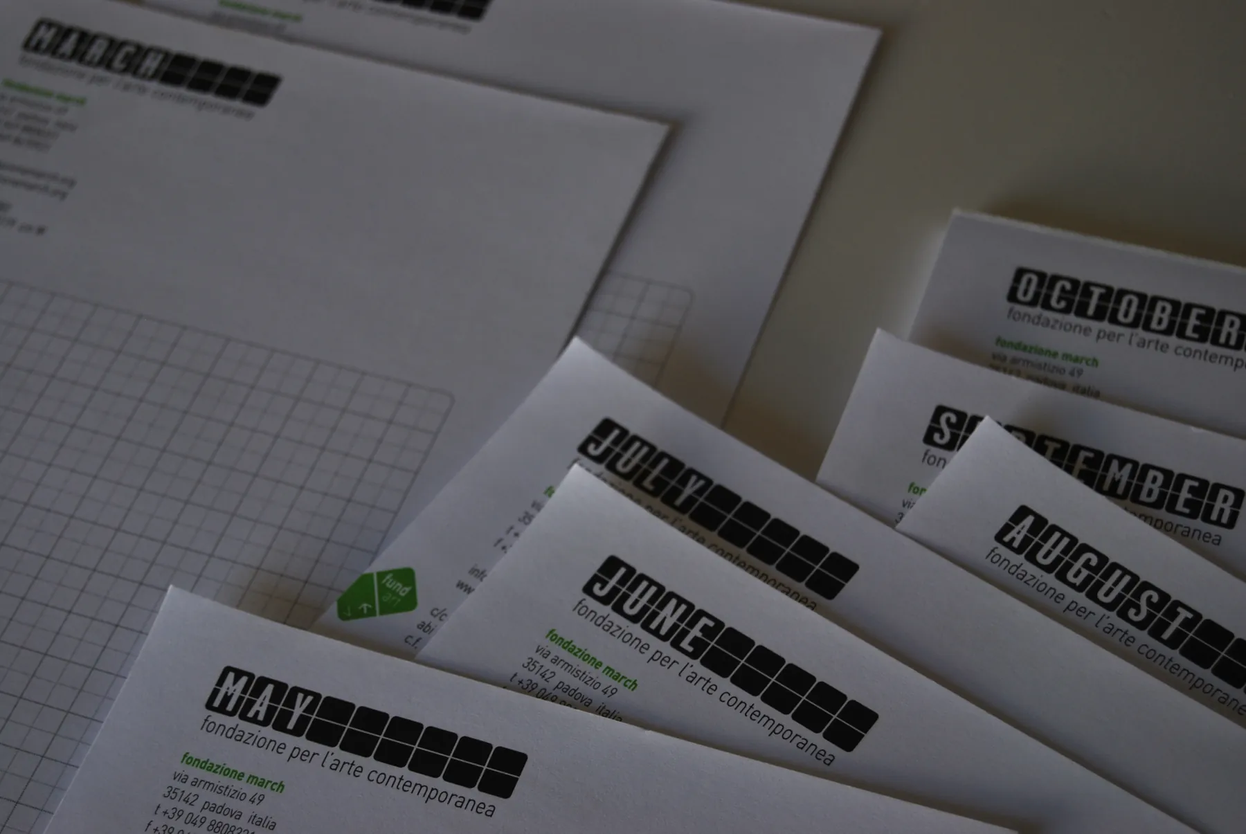
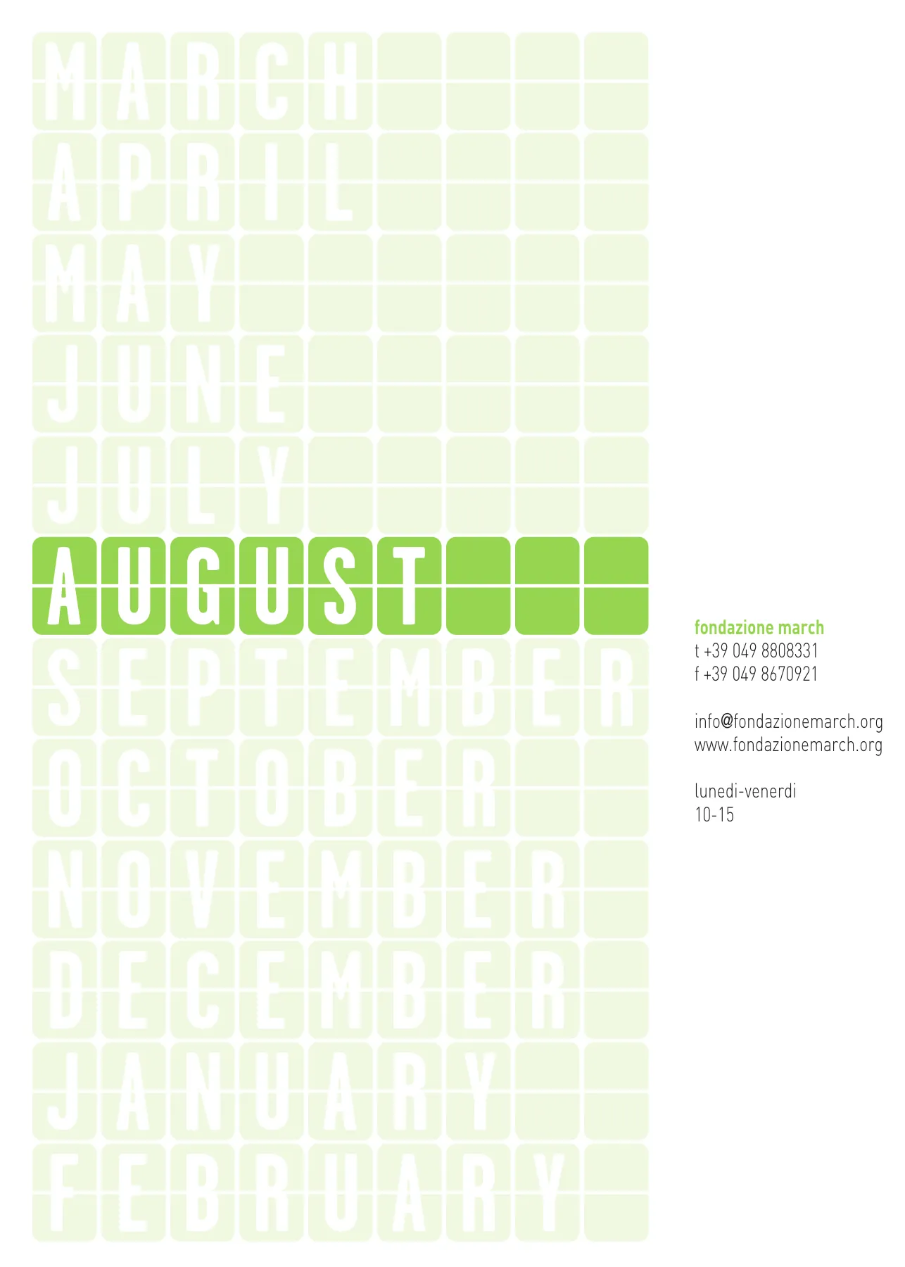
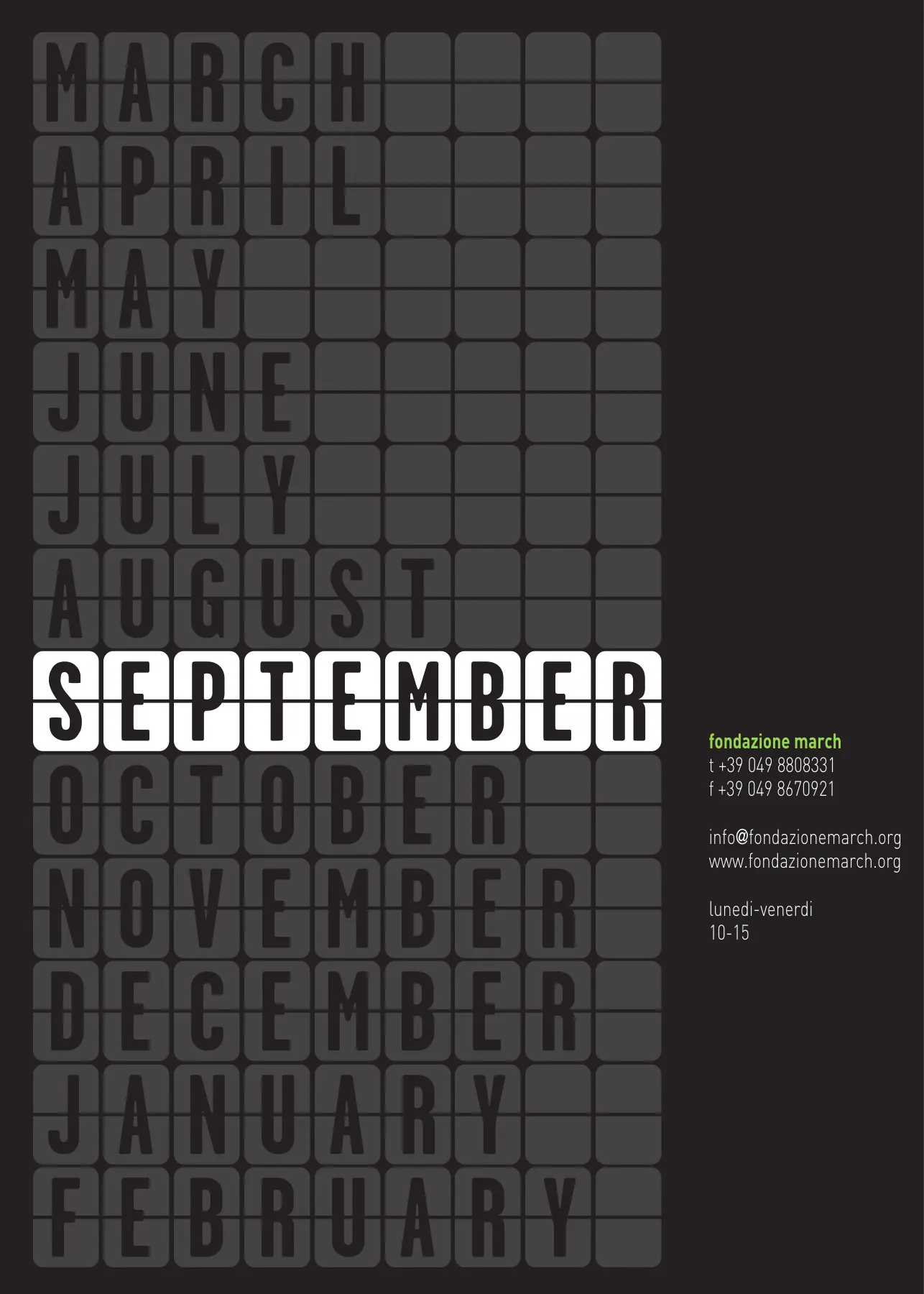
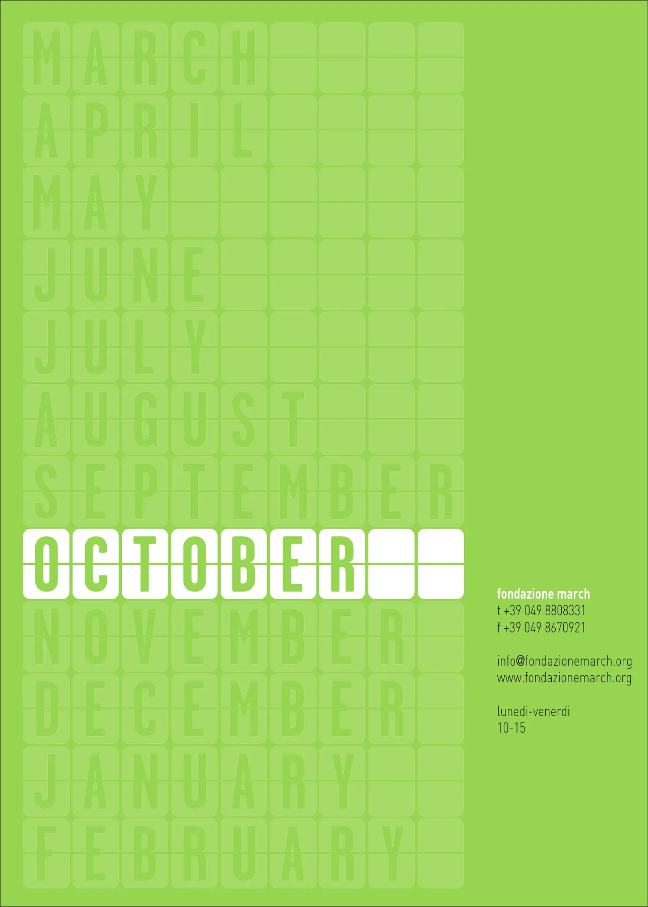
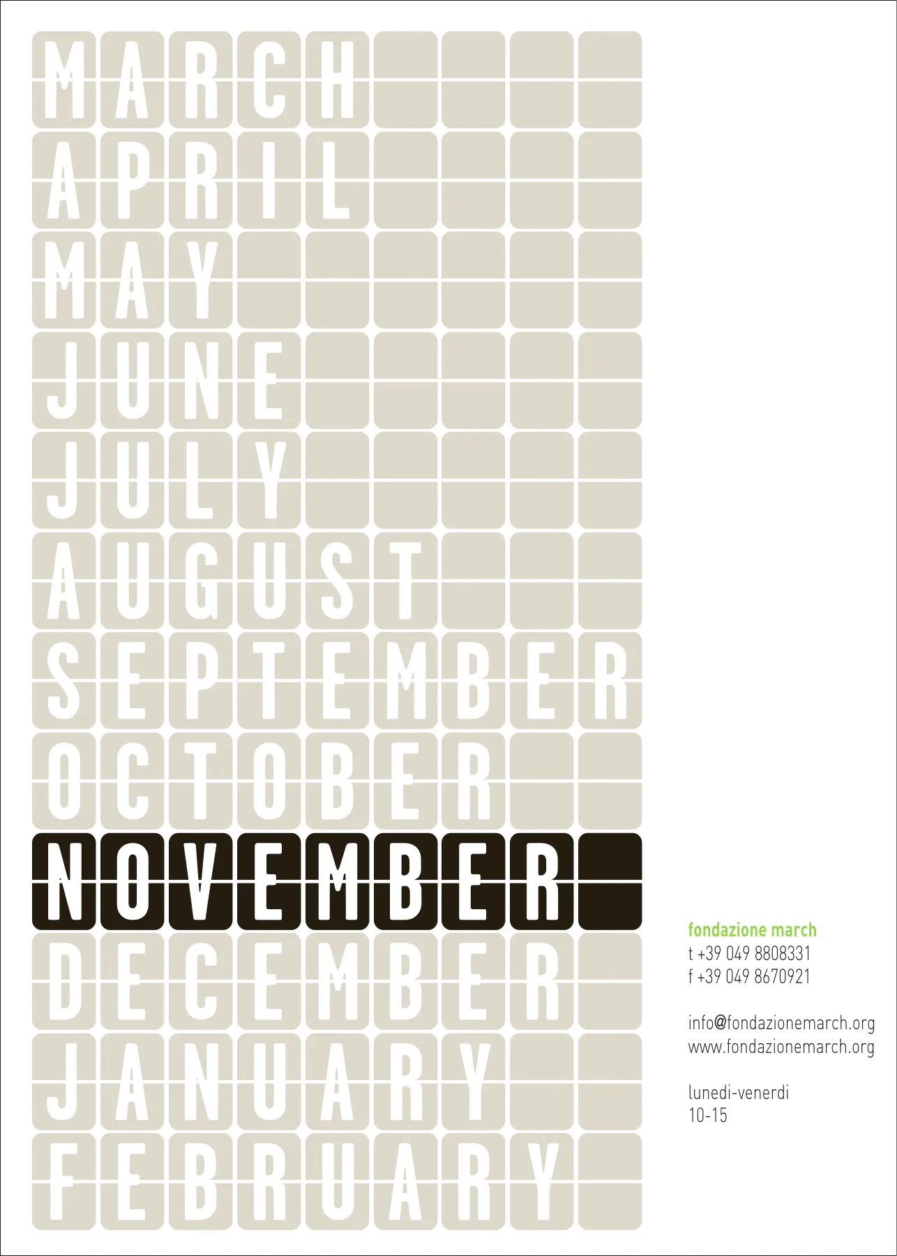
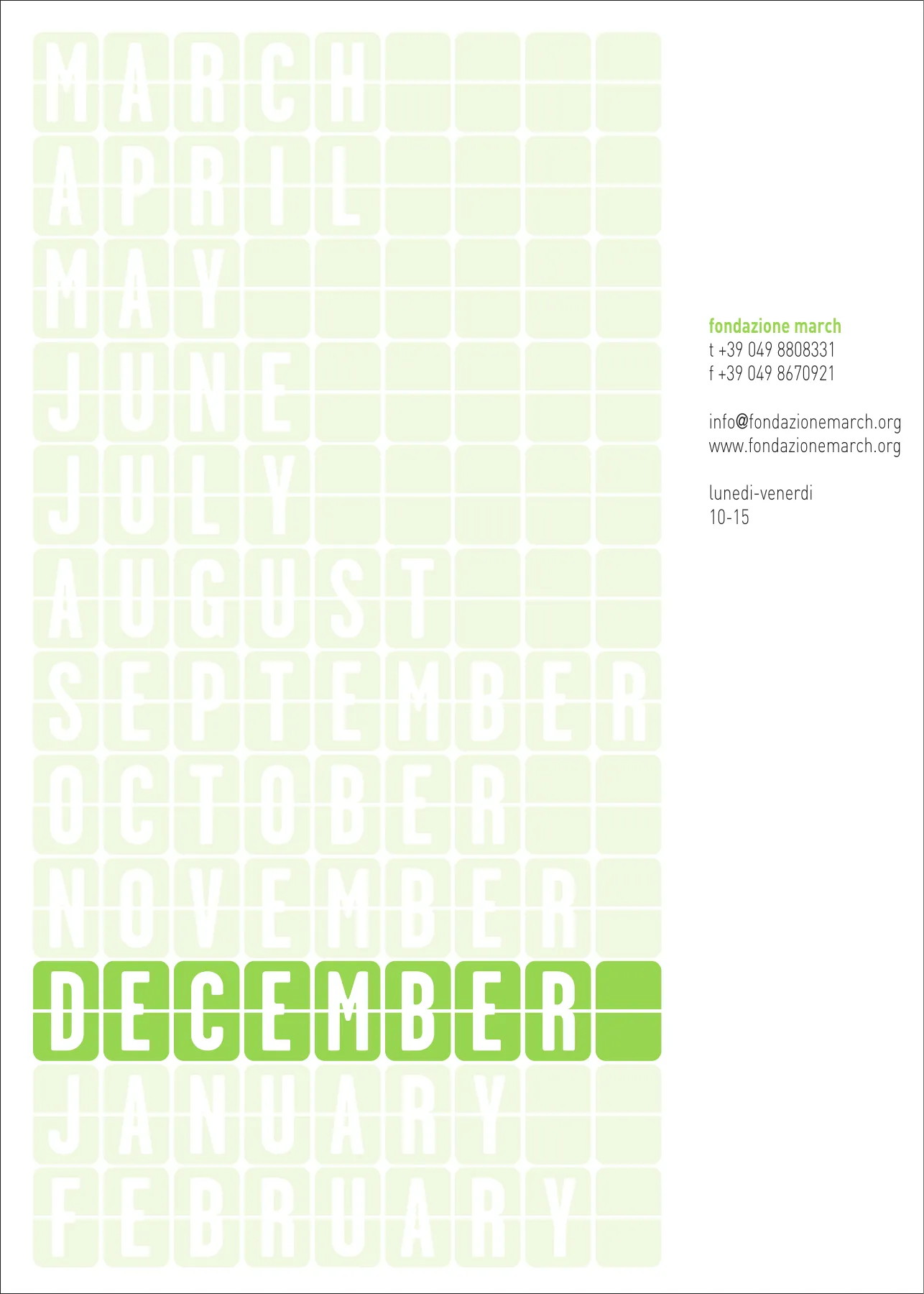
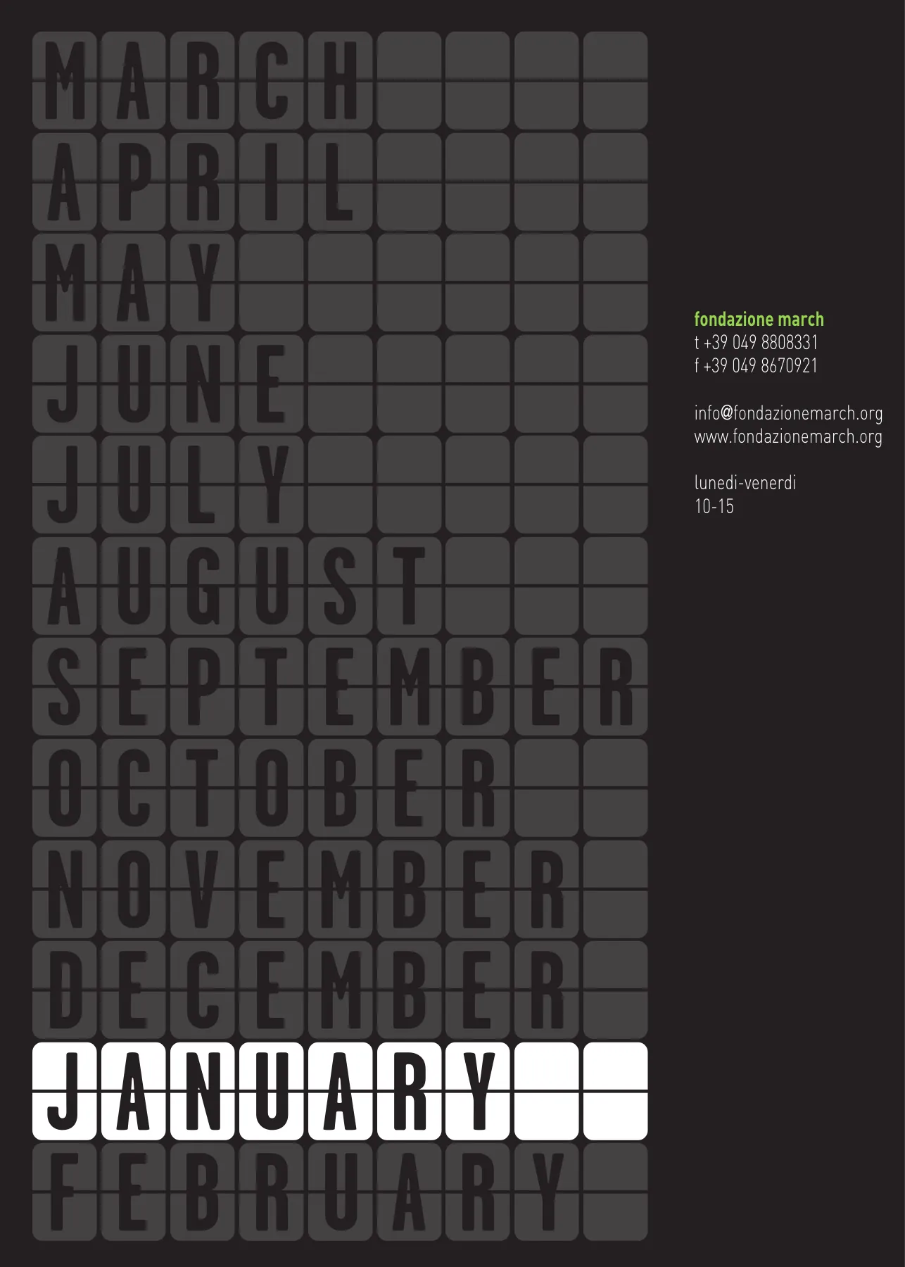
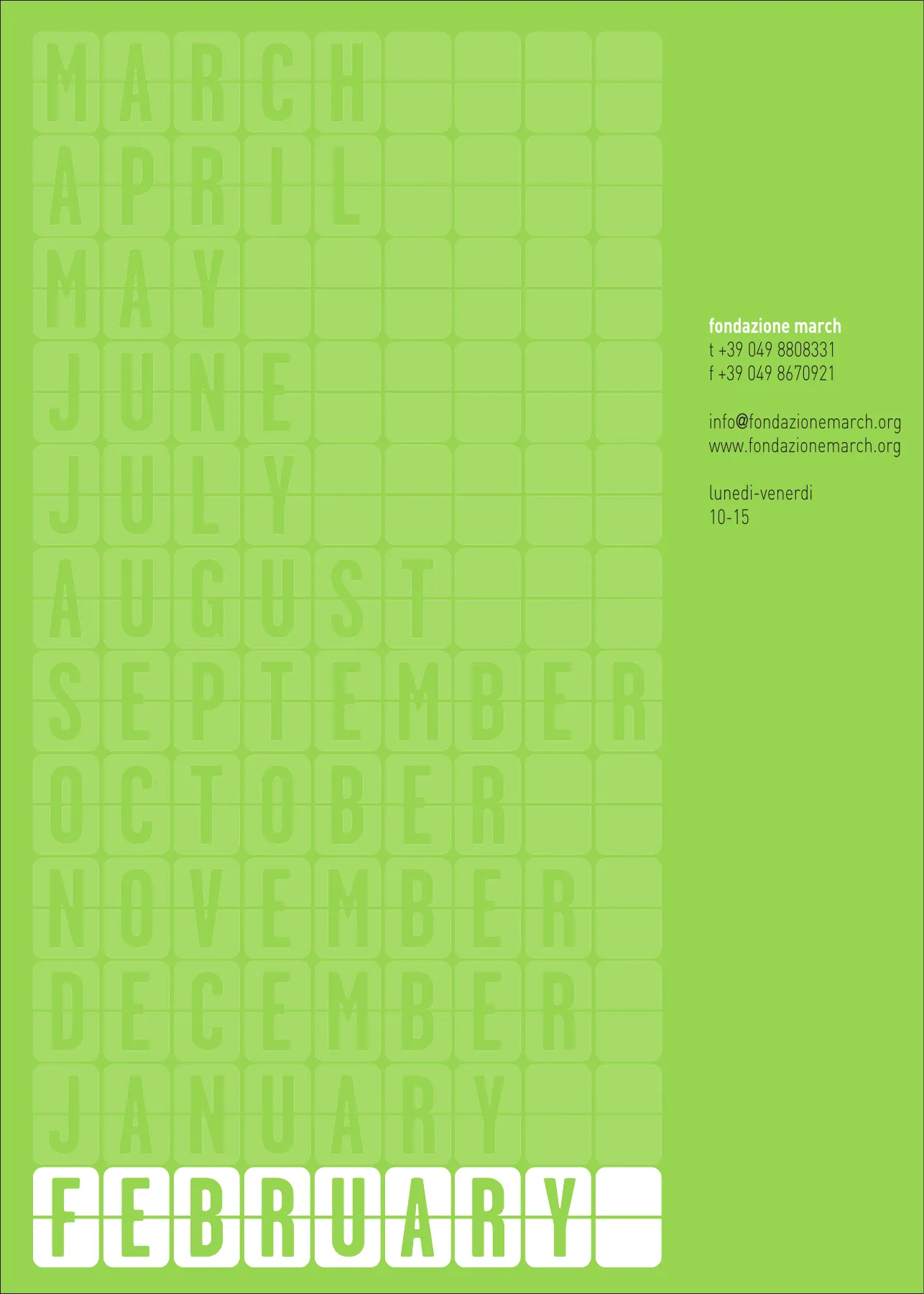
The “march” typeface is used for the twelve logos. The maximum length is nine tiles – SEPTEMBER – and shorter months leave the remaining tiles blank, so the logo always keeps the same size. Below, the fixed wording “fondazione per l’arte contemporanea” in DIN Light, set six units away and aligned with the letter inside the first tile.
- foundation for contemporary art
- foundation for contemporary art
- foundation for contemporary art
- foundation for contemporary art
- foundation for contemporary art
- foundation for contemporary art
- foundation for contemporary art
- foundation for contemporary art
- foundation for contemporary art
- foundation for contemporary art
- foundation for contemporary art
- foundation for contemporary art
The “march” typeface
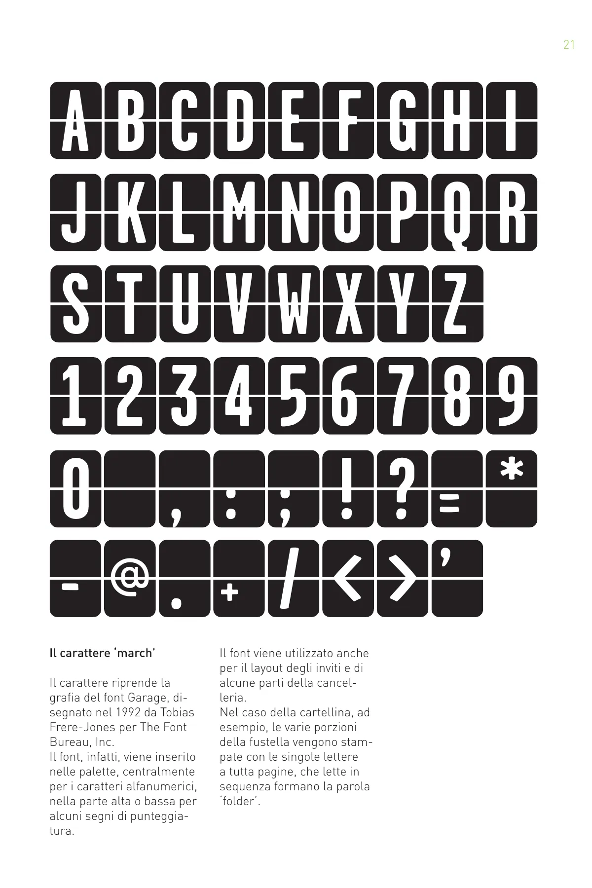
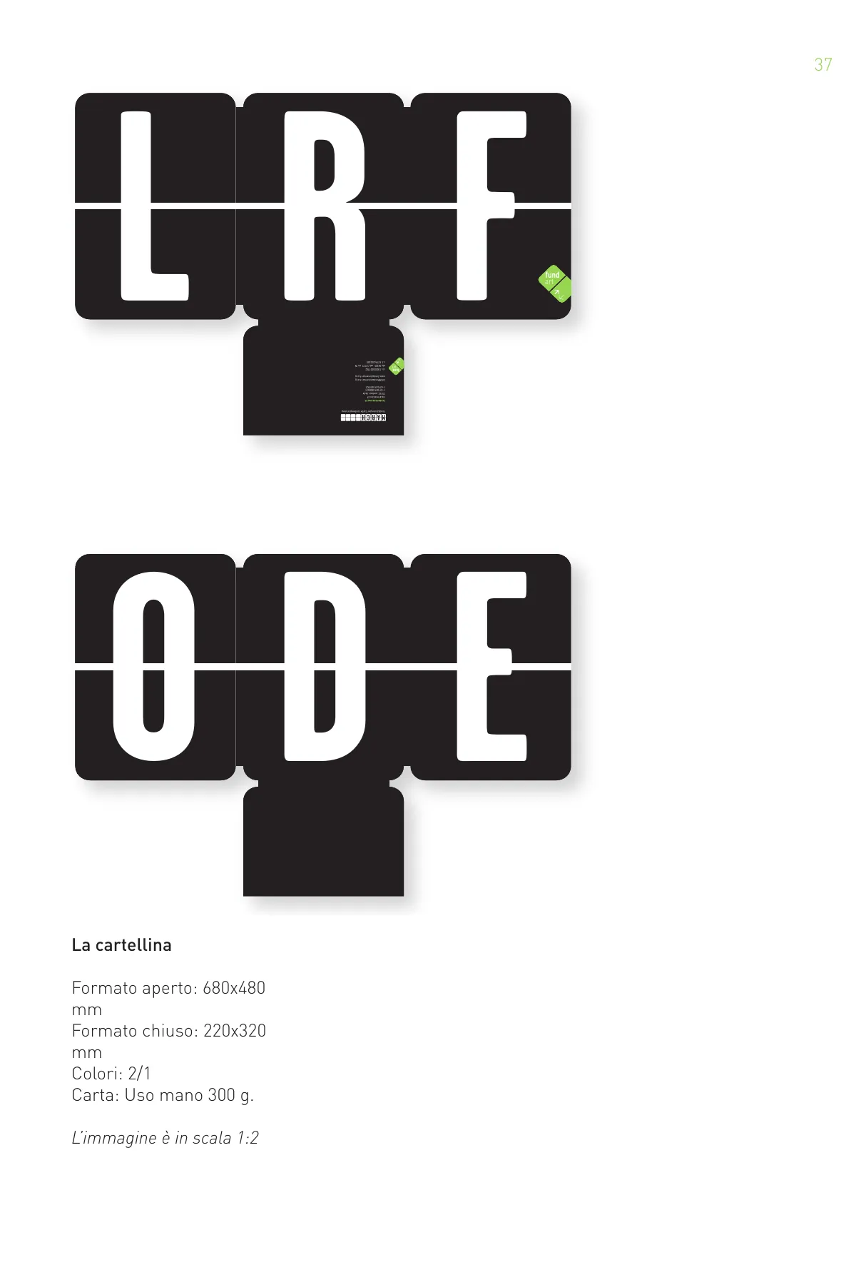
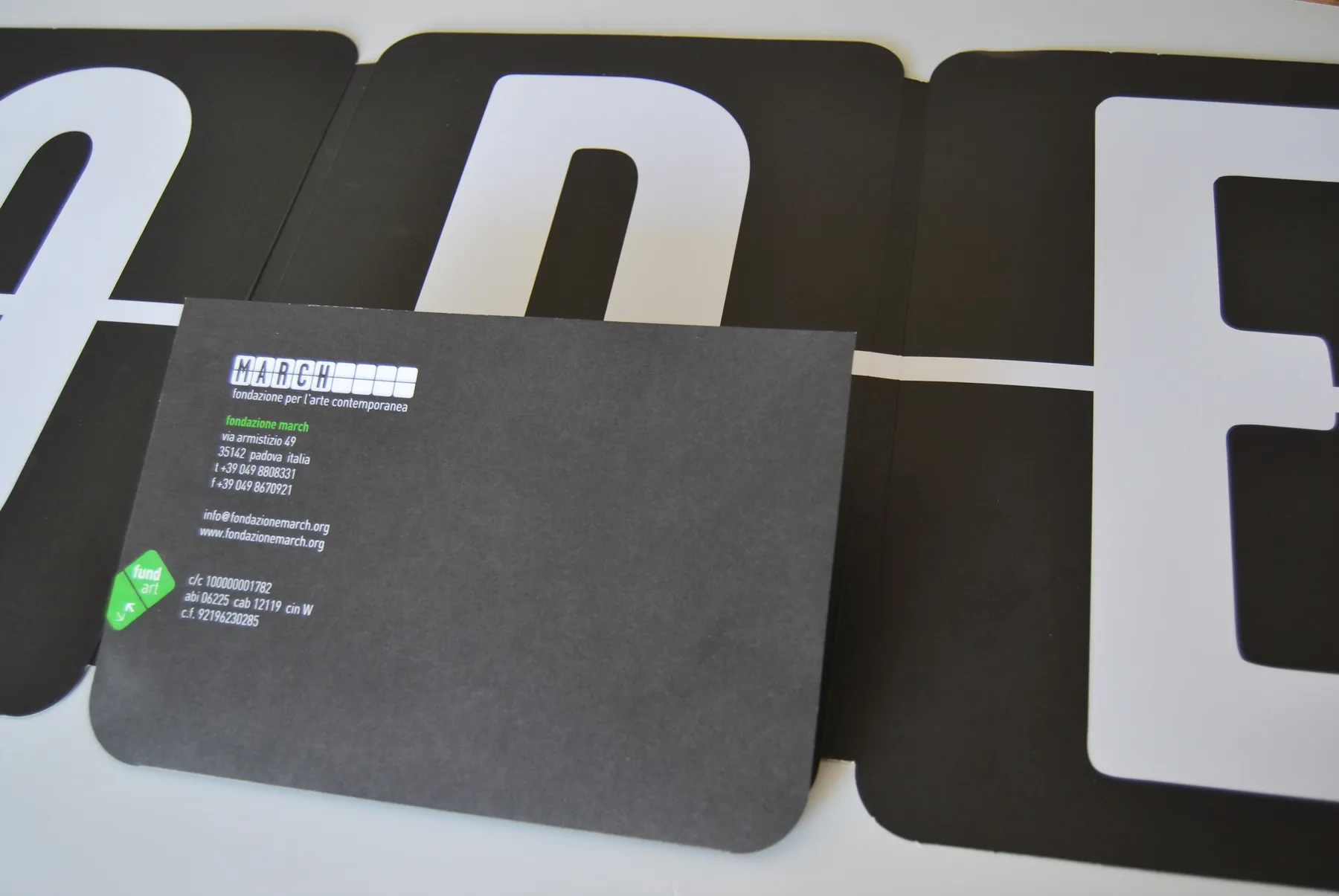
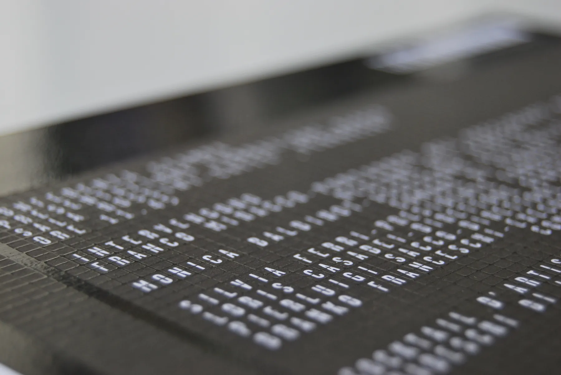
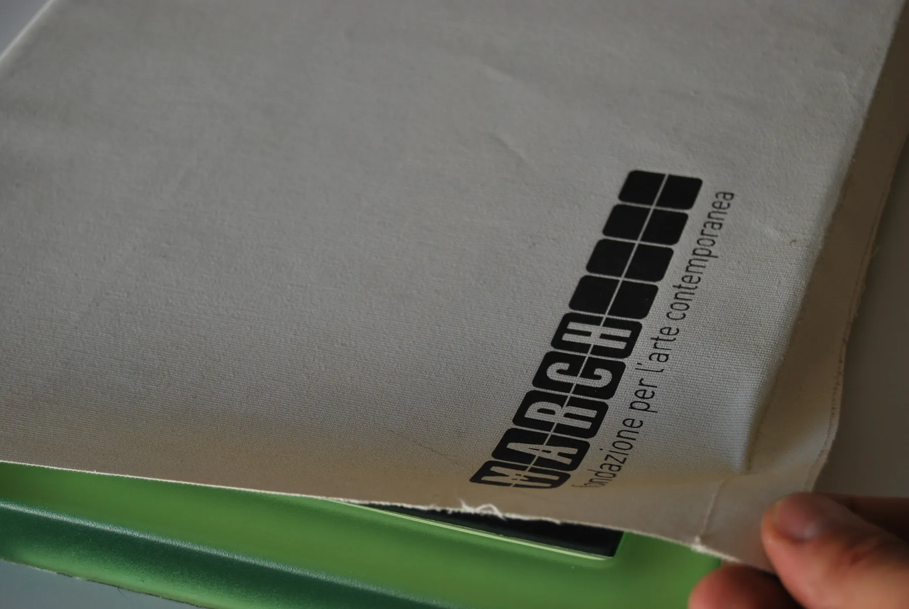
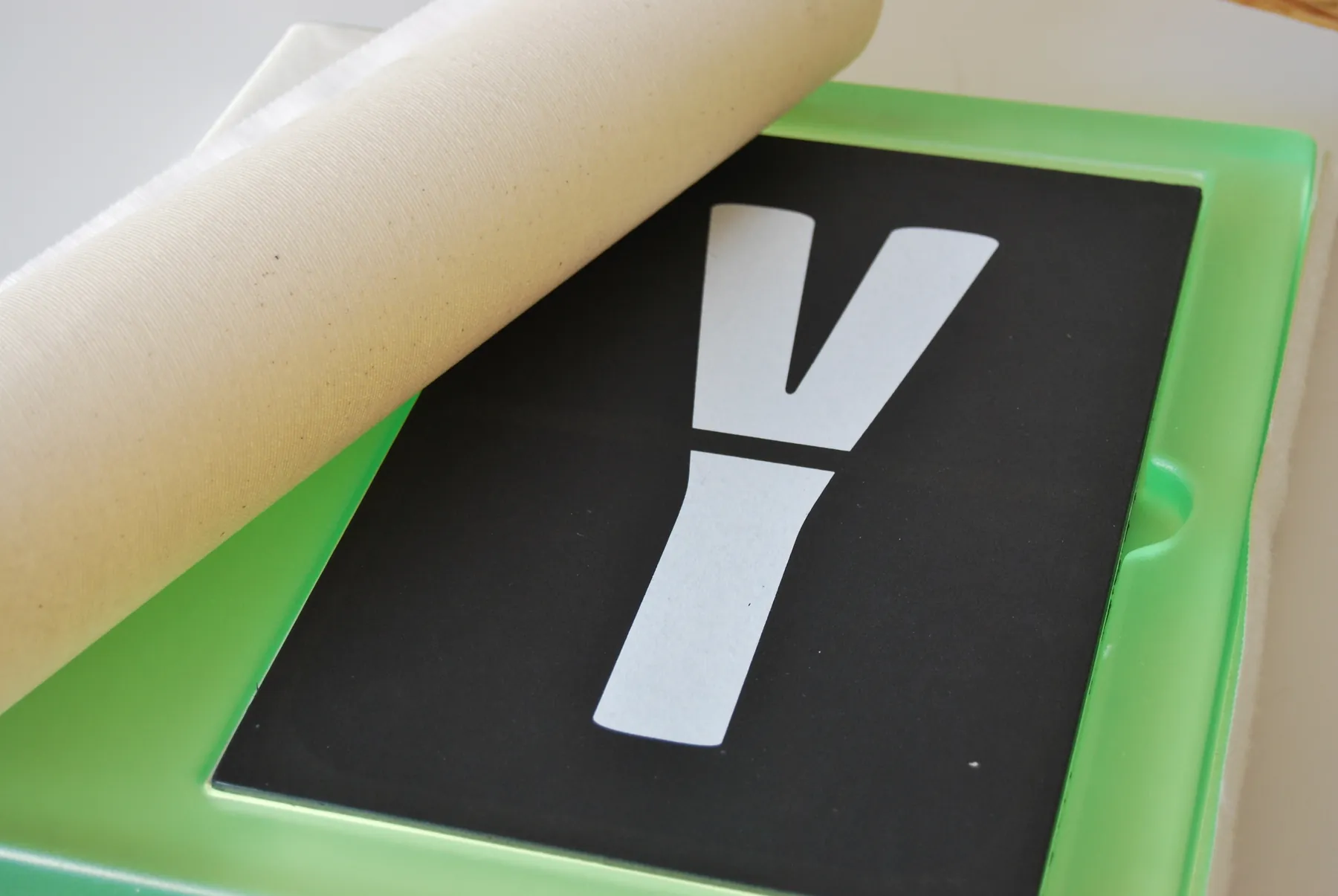
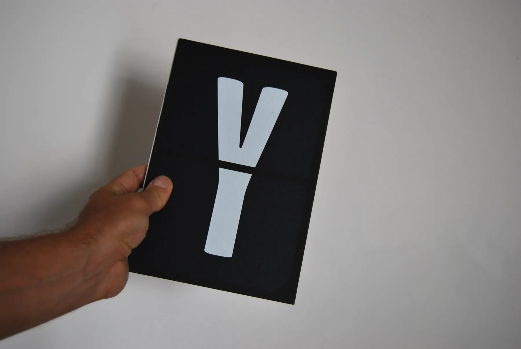
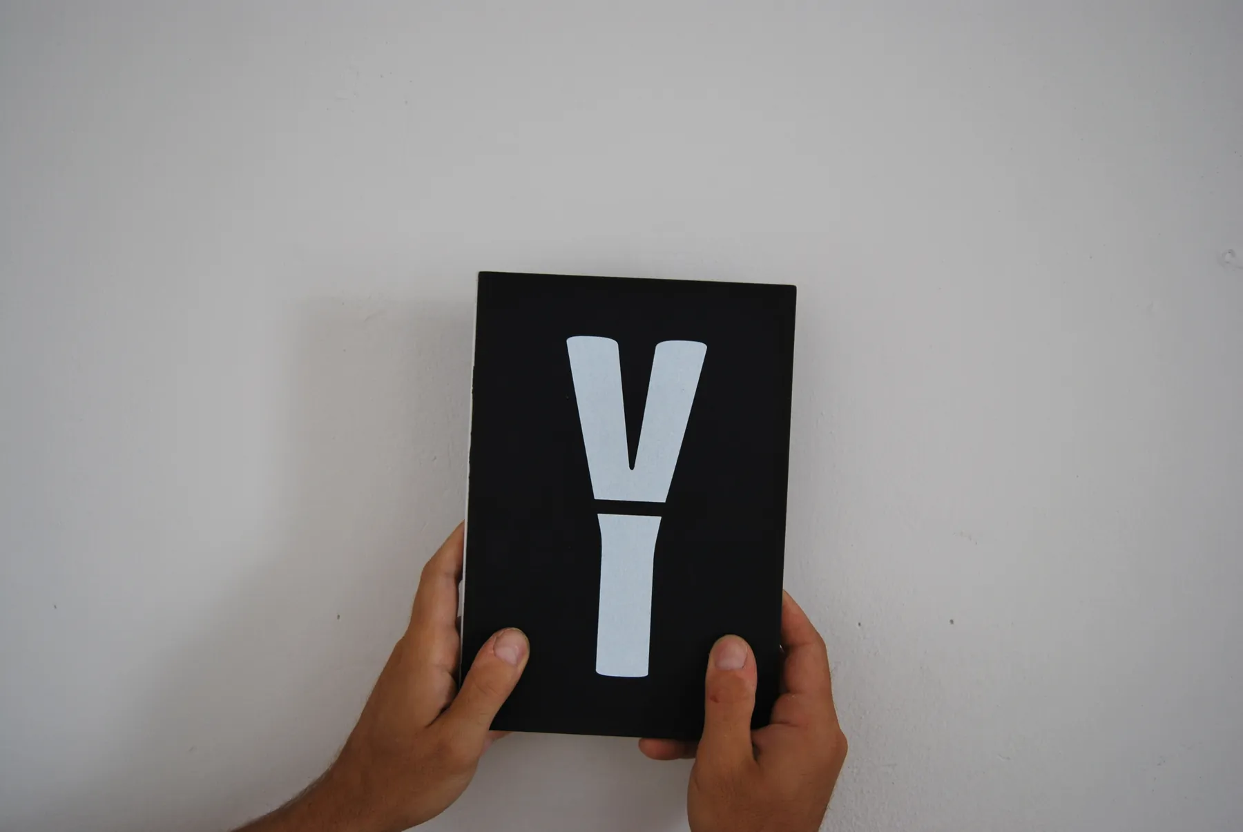
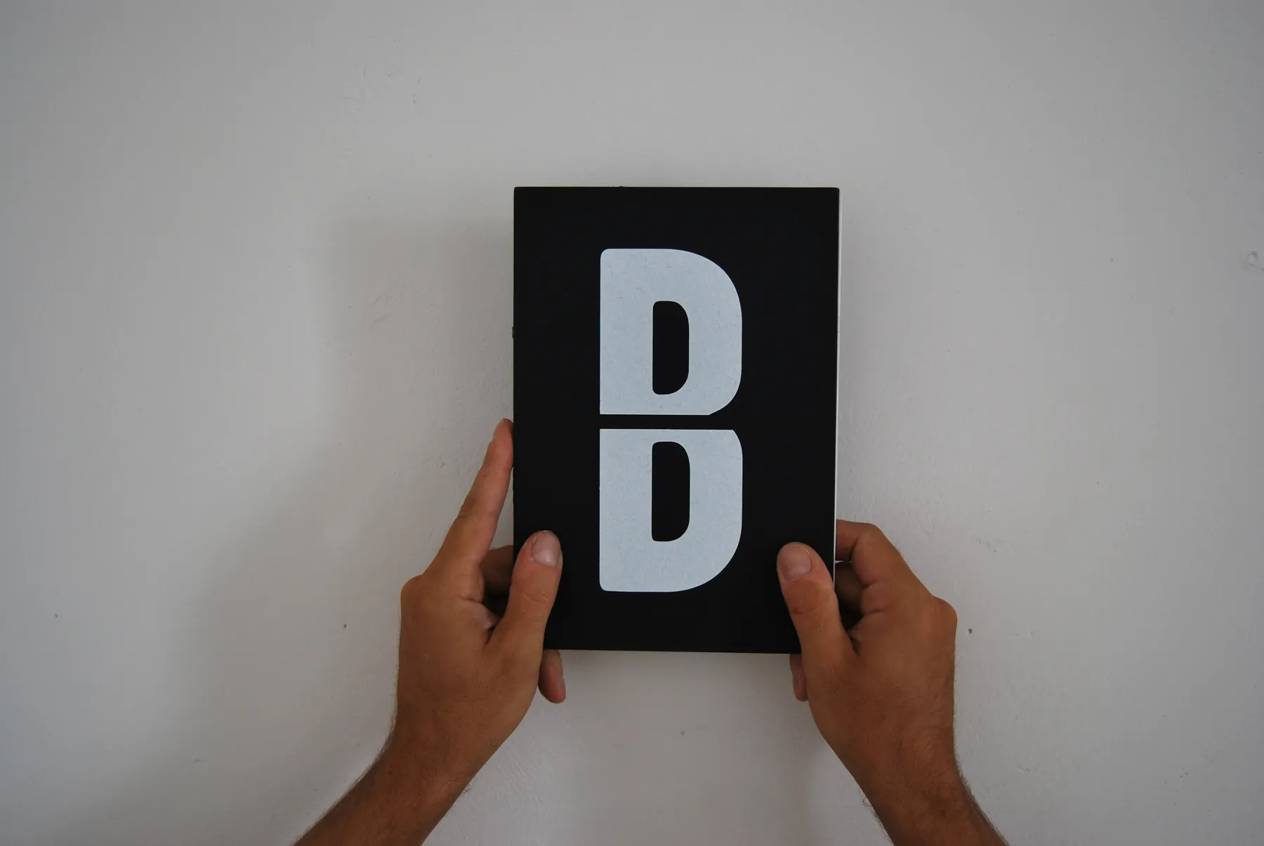
The typeface takes the letterforms of Garage Gothic, designed in 1992 by Tobias Frere-Jones for The Font Bureau, and sets them inside tiles: centred for letters and numbers, at the top or bottom for some punctuation marks. Each tile follows the proportions of an A4 sheet, and the base unit keeps the line between the two halves visible even at small sizes. The font is also used for invitations and stationery: the folder, for instance, is printed with single full-page letters that, read in sequence, spell the word “folder”.
Colours
Black is the base colour: it defines “the fact”, an almost journalistic account of events, and restores the balance upset by the disorienting naming.
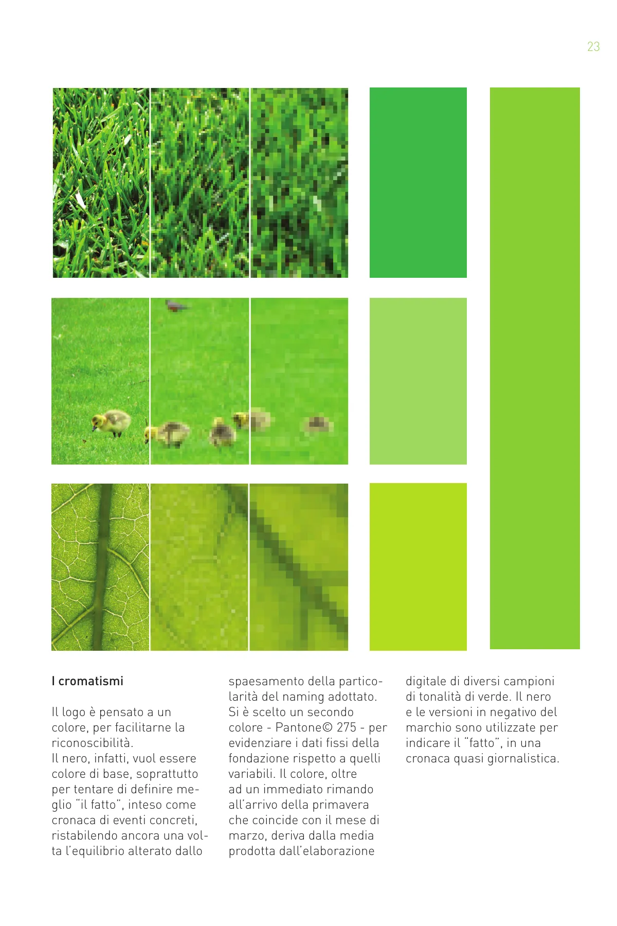
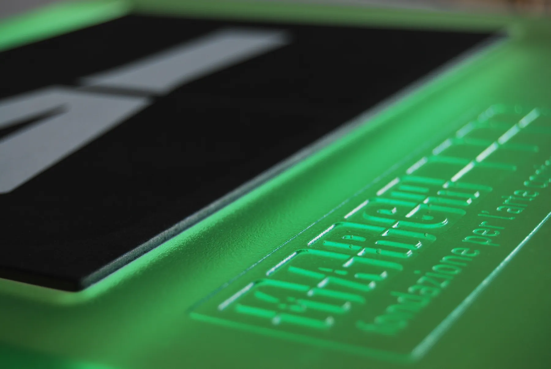
Pantone 375 green highlights the foundation’s fixed information as opposed to the variable one. Beyond its obvious reference to spring, which begins in March, it comes from averaging samples of green taken from photographs shot in the month of March.
- Black
#111111 - Pantone 375
#8cc63f
The rules
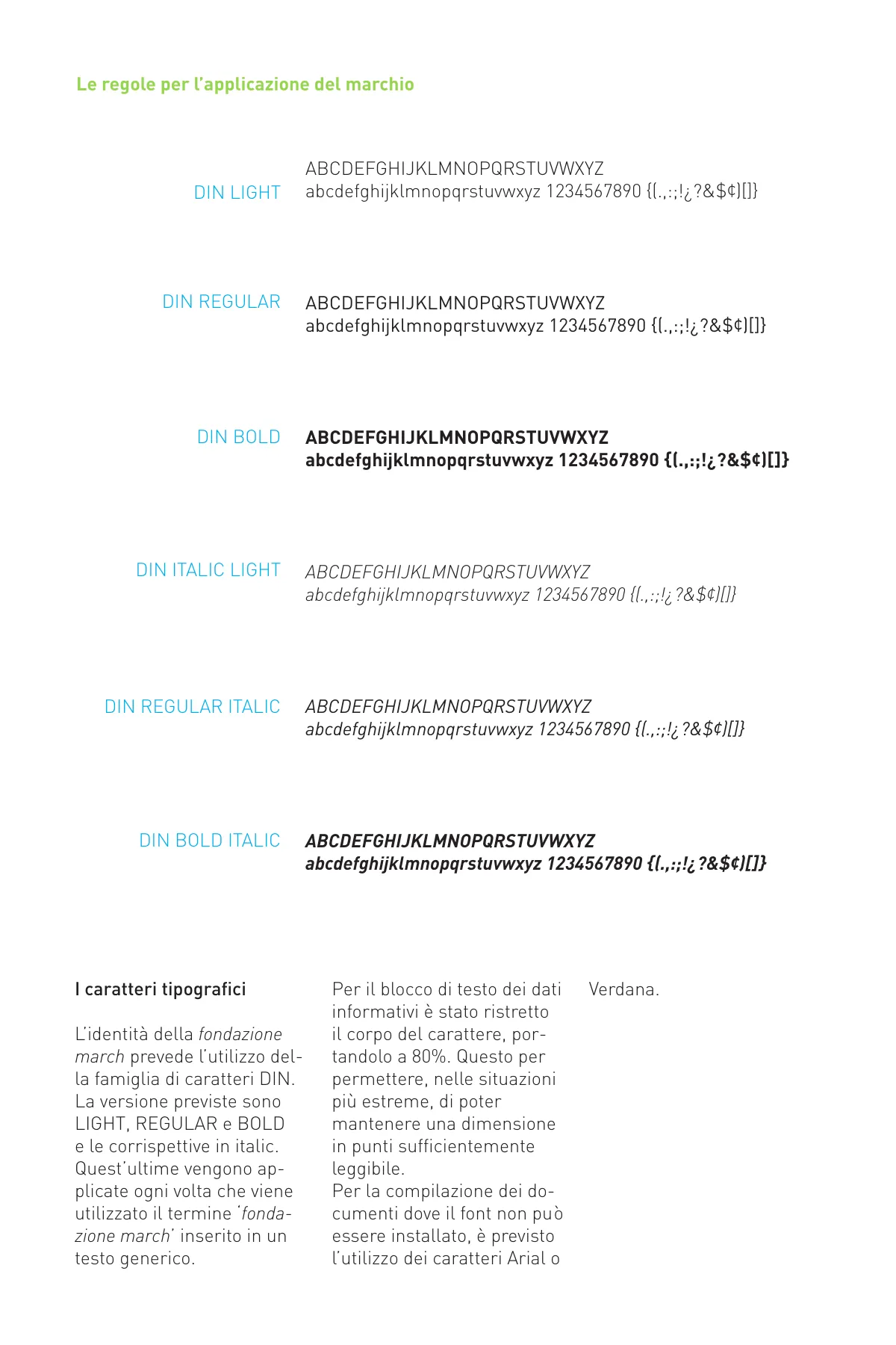
The manual sets minimum clear space, alignments and mistakes to avoid. The corporate type family is DIN – Light, Regular and Bold with their italics, used whenever “fondazione march” appears in running text. For documents where the font cannot be installed: Arial or Verdana.
The “fund art” badge
Developed with goodwill, the badge signals the possibility of taking an active part in the foundation’s growth: an empty tile rotated by 45° with the words “fund art” and two arrows representing the exchange between individuals, companies or institutions and the foundation. It appears on stationery, brochures and leaflets, next to the bank transfer details.


Stationery, catalogues, gadgets
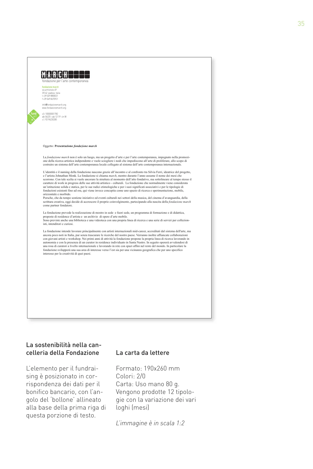
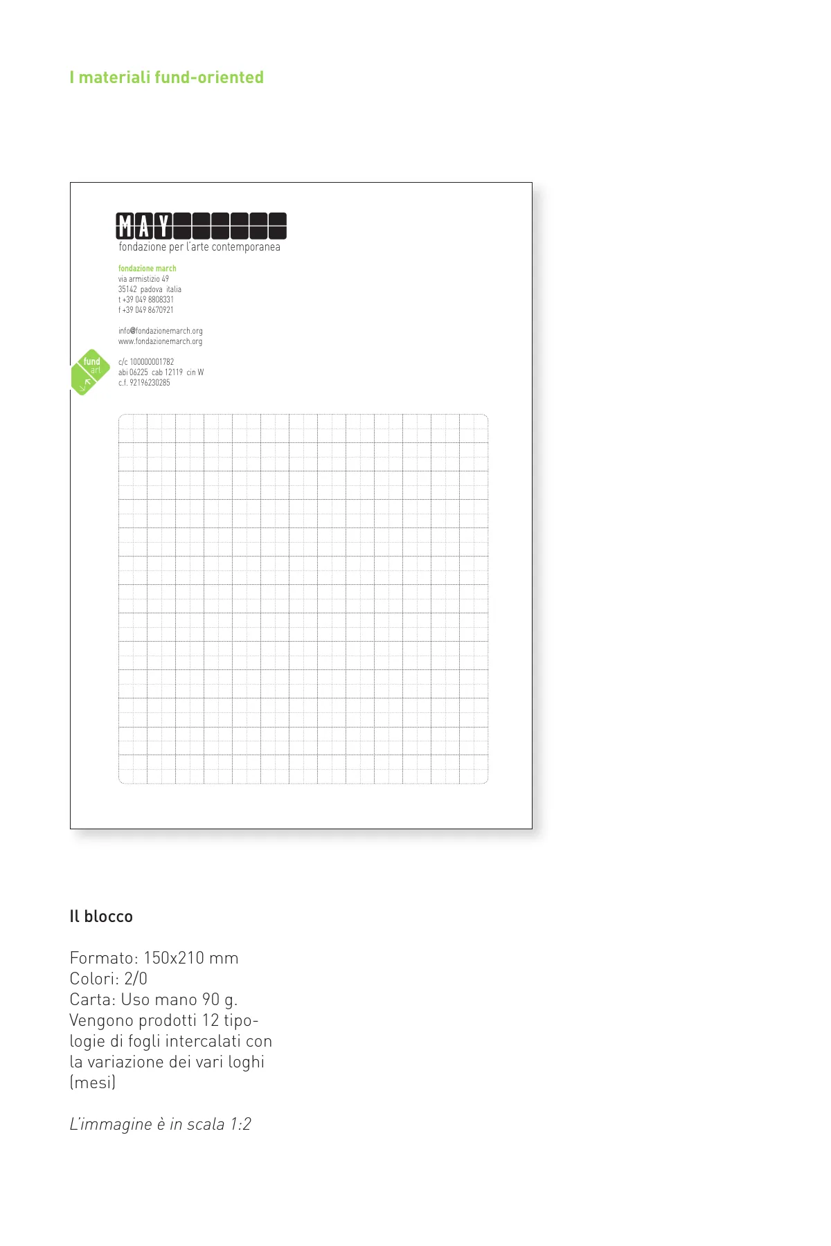
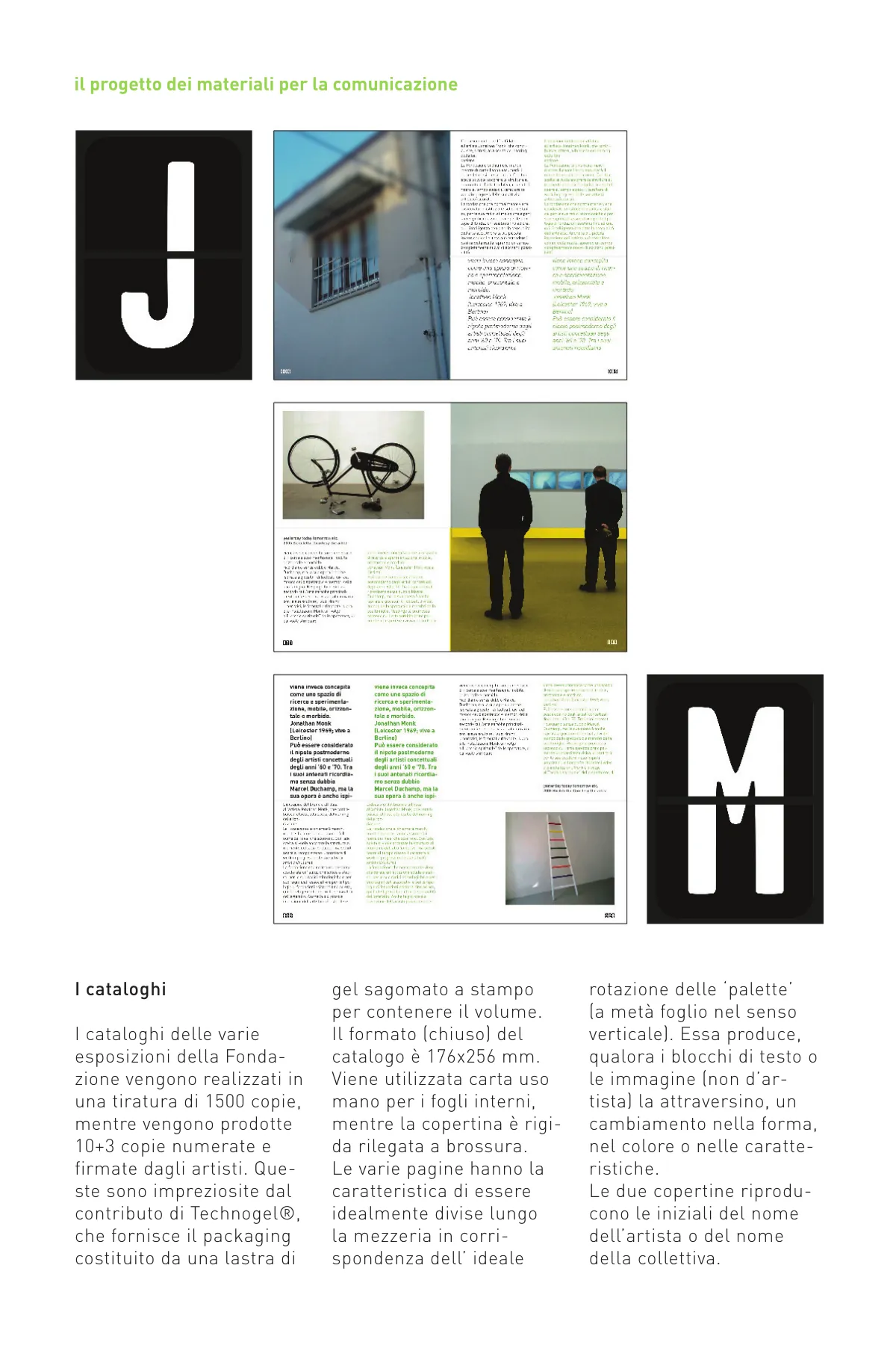
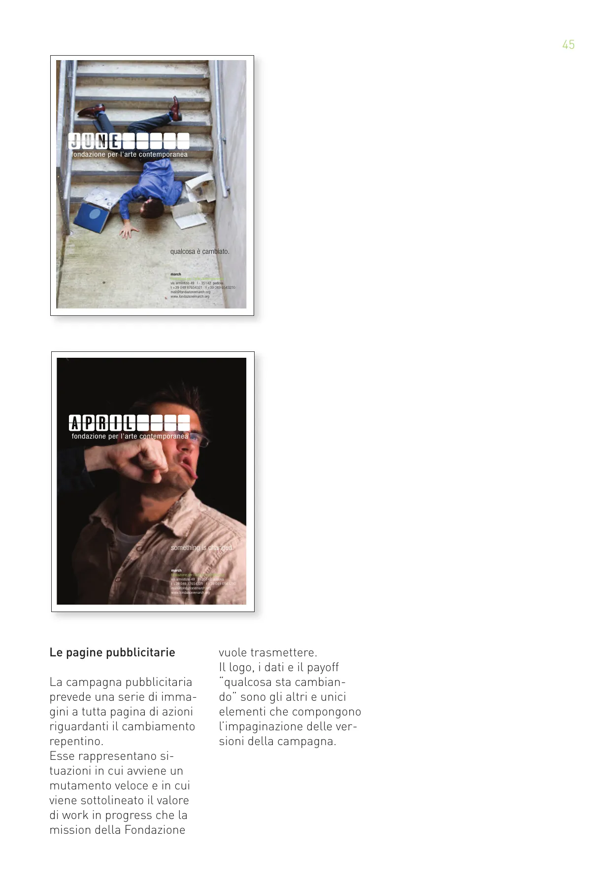
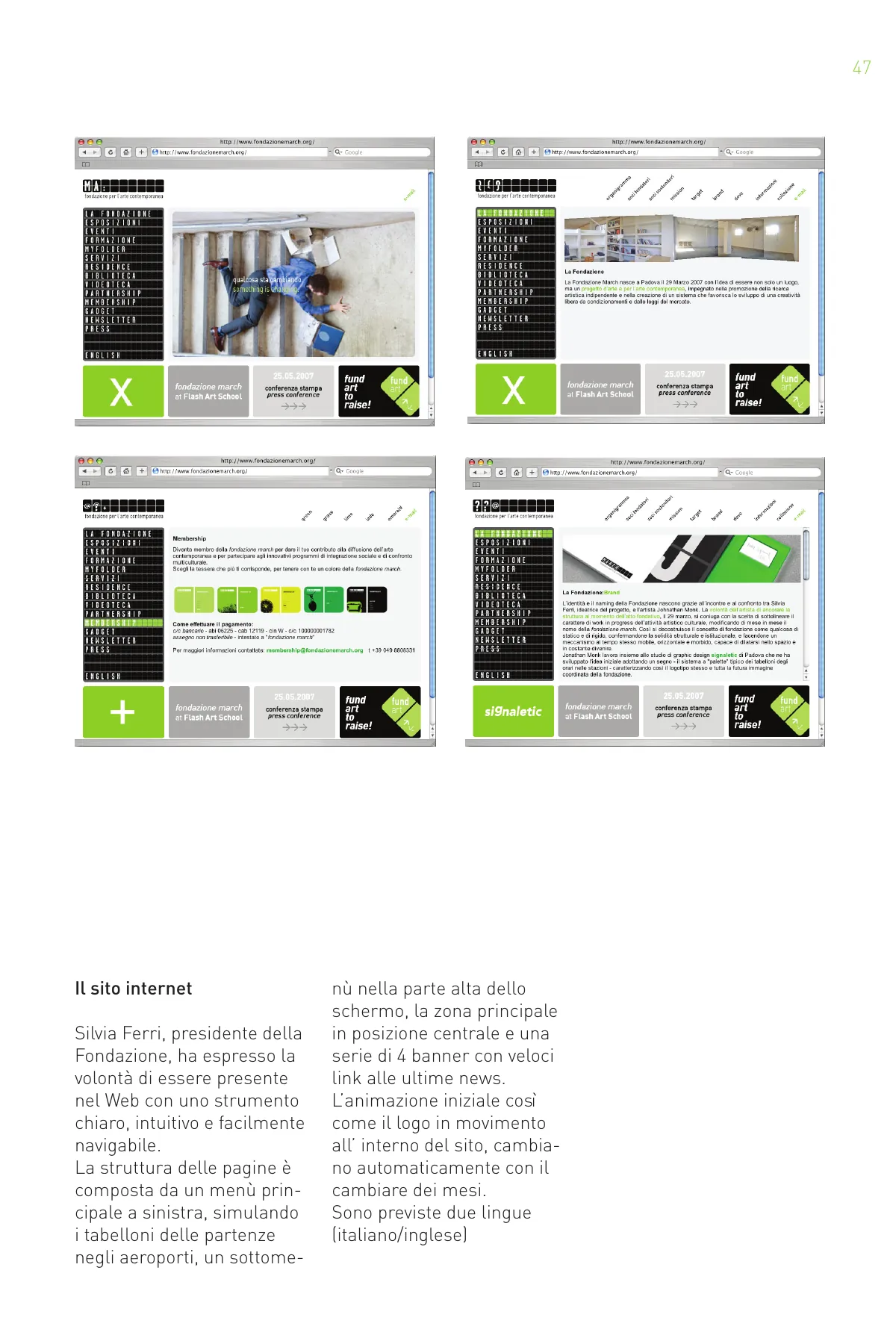
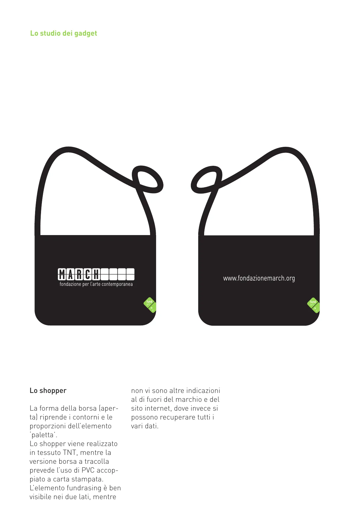
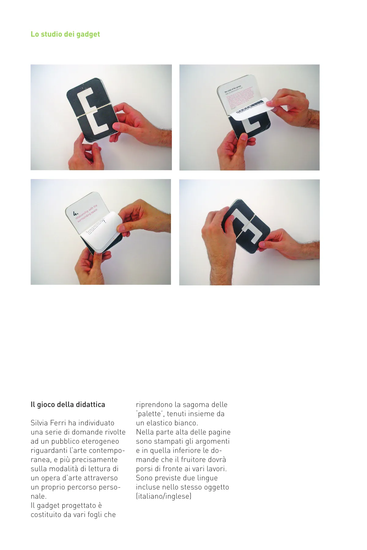
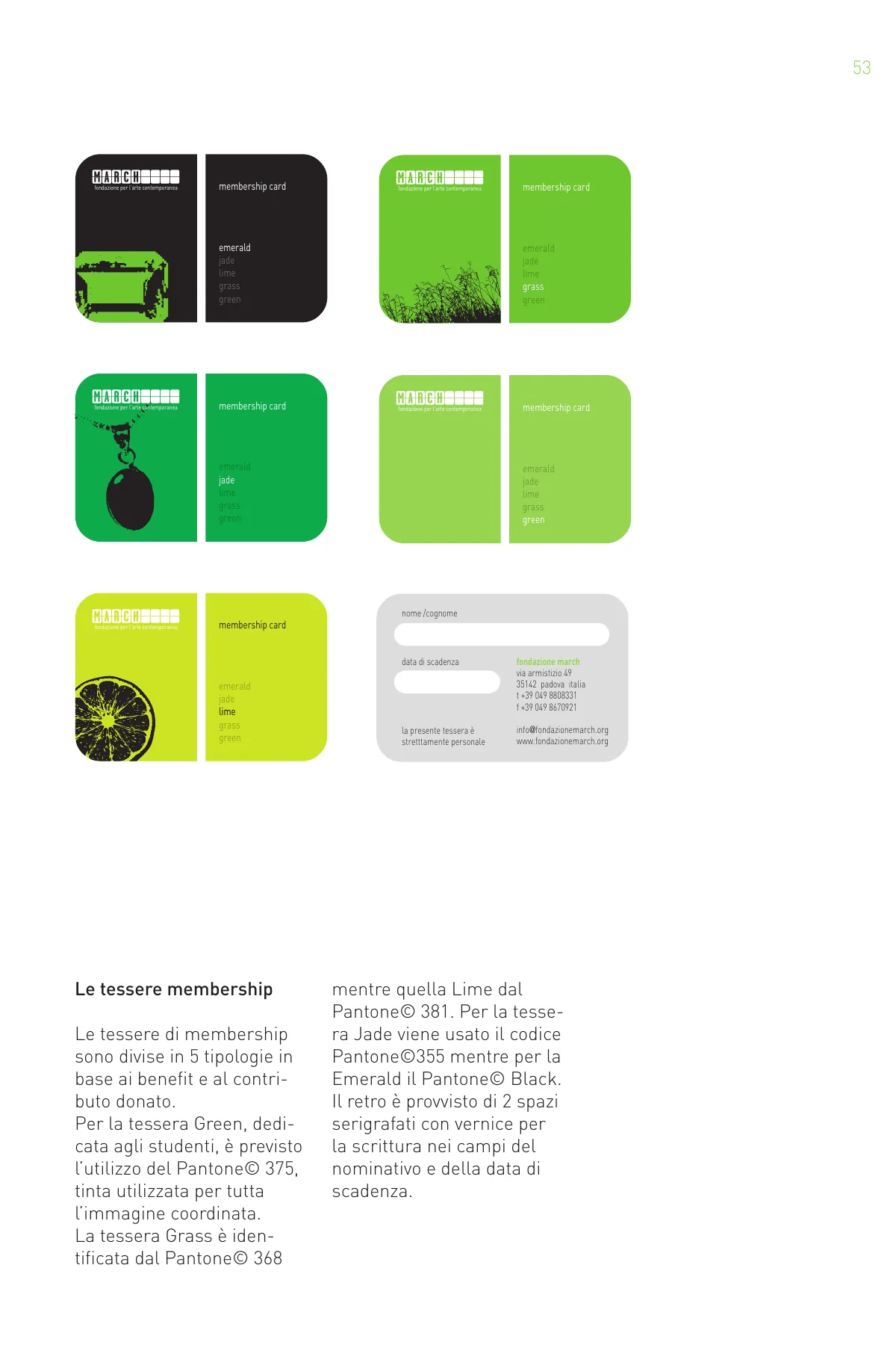
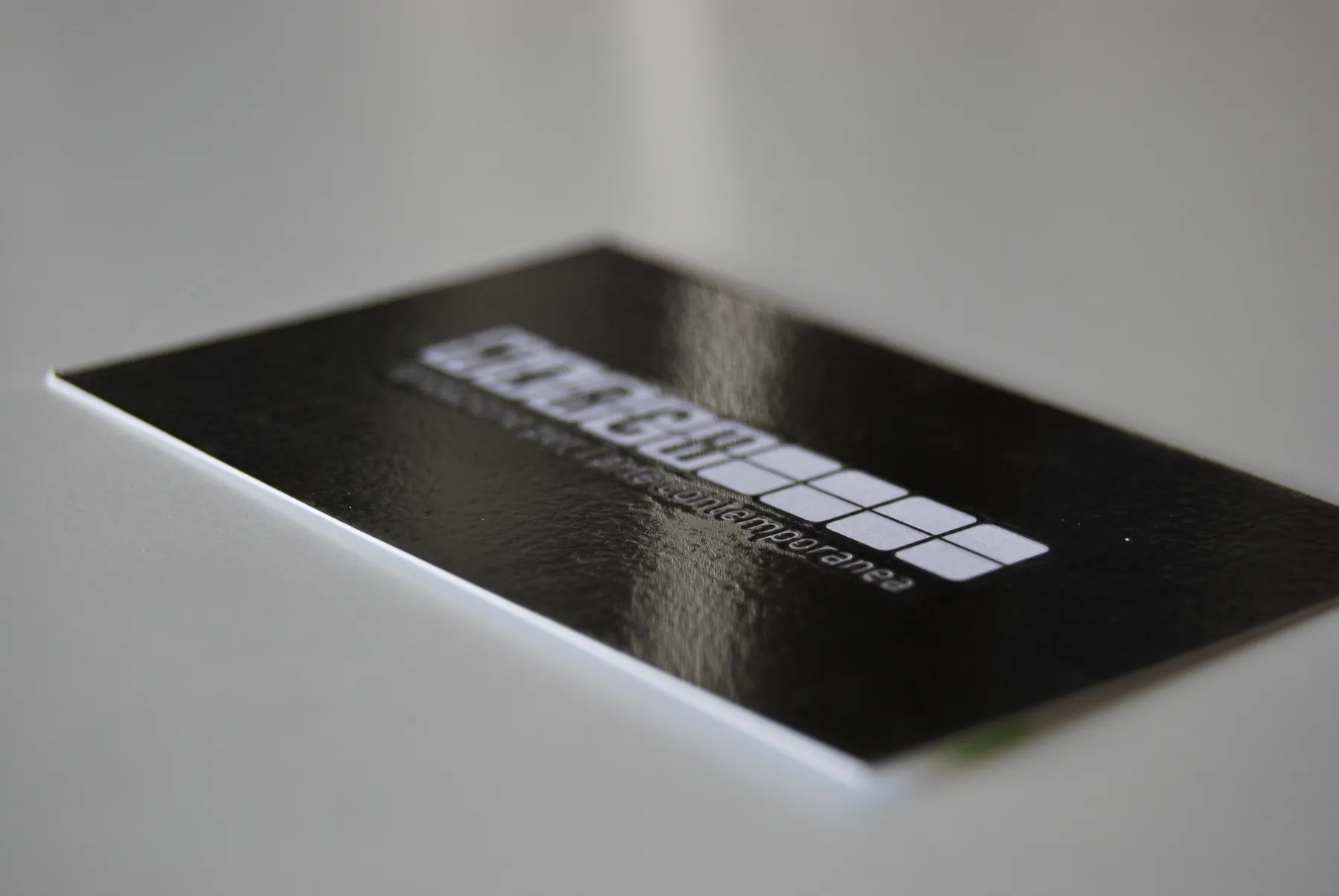
Letterheads, envelopes and notepads in twelve versions, one per month; business cards, folders, catalogues, invitations, adverts, press sheets, the website. And the objects: the shopping bag, pencils, the education game, the membership cards in five greens – Green, Grass, Lime, Jade, Emerald.

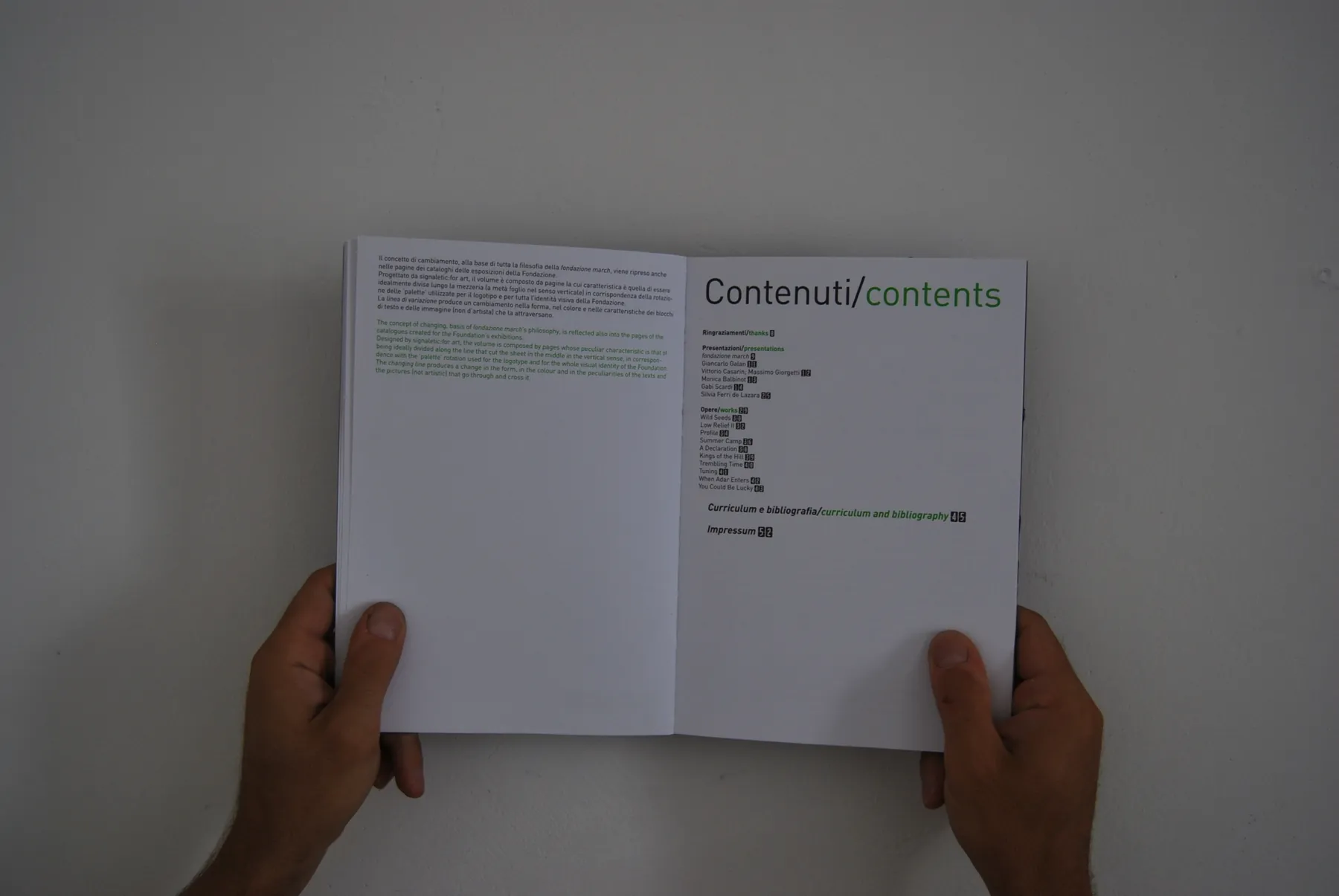
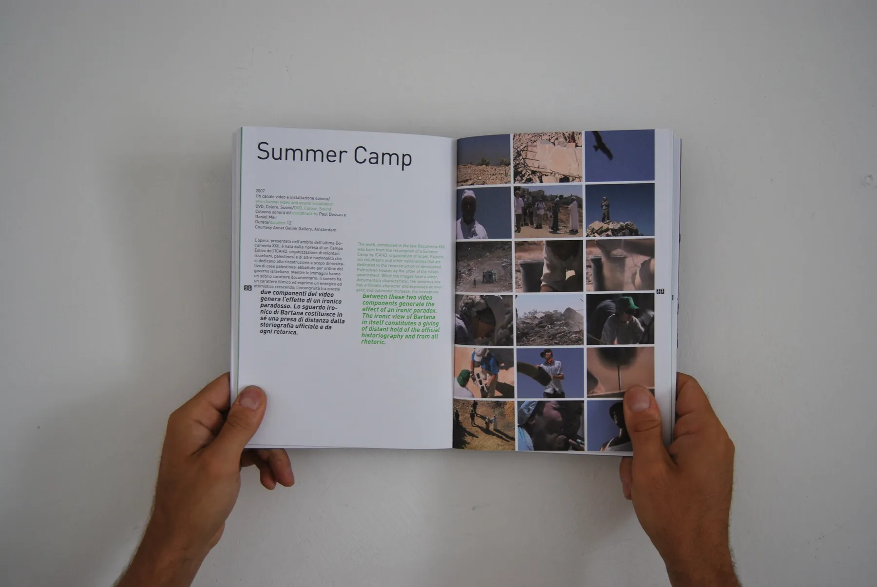
Jonathan Monk’s billboard
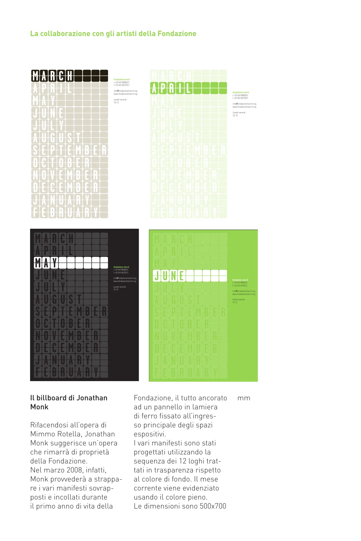
Monk’s proposal for the façade: a small billboard reading MARCH, to be pasted over every month with the next month’s poster – APRIL over MARCH, MAY over APRIL – until, after twelve months, everything is torn off to reveal MARCH again. What remains is a Mimmo Rotella-like paper work, signed by the artist as an edition for the foundation. The name is always black; the posters change colour.
The venue and signage
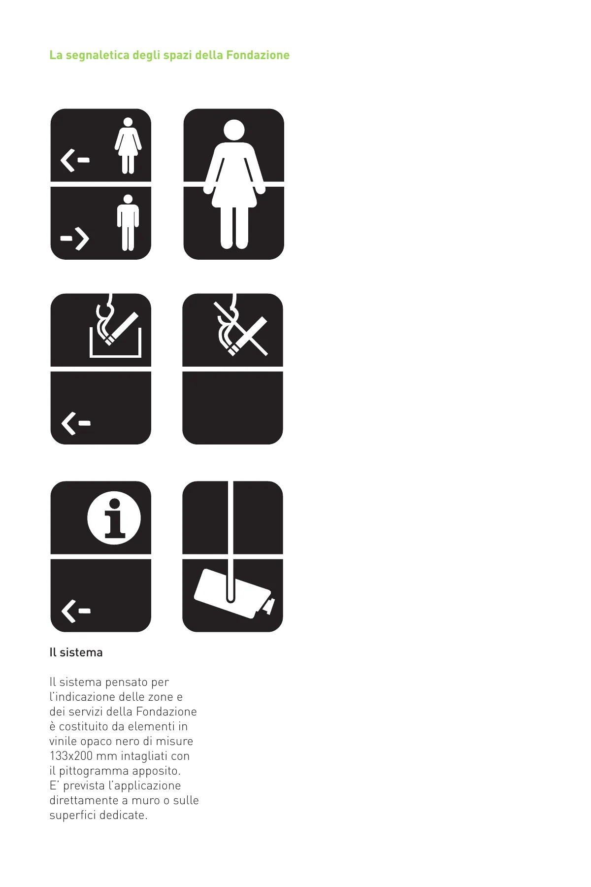
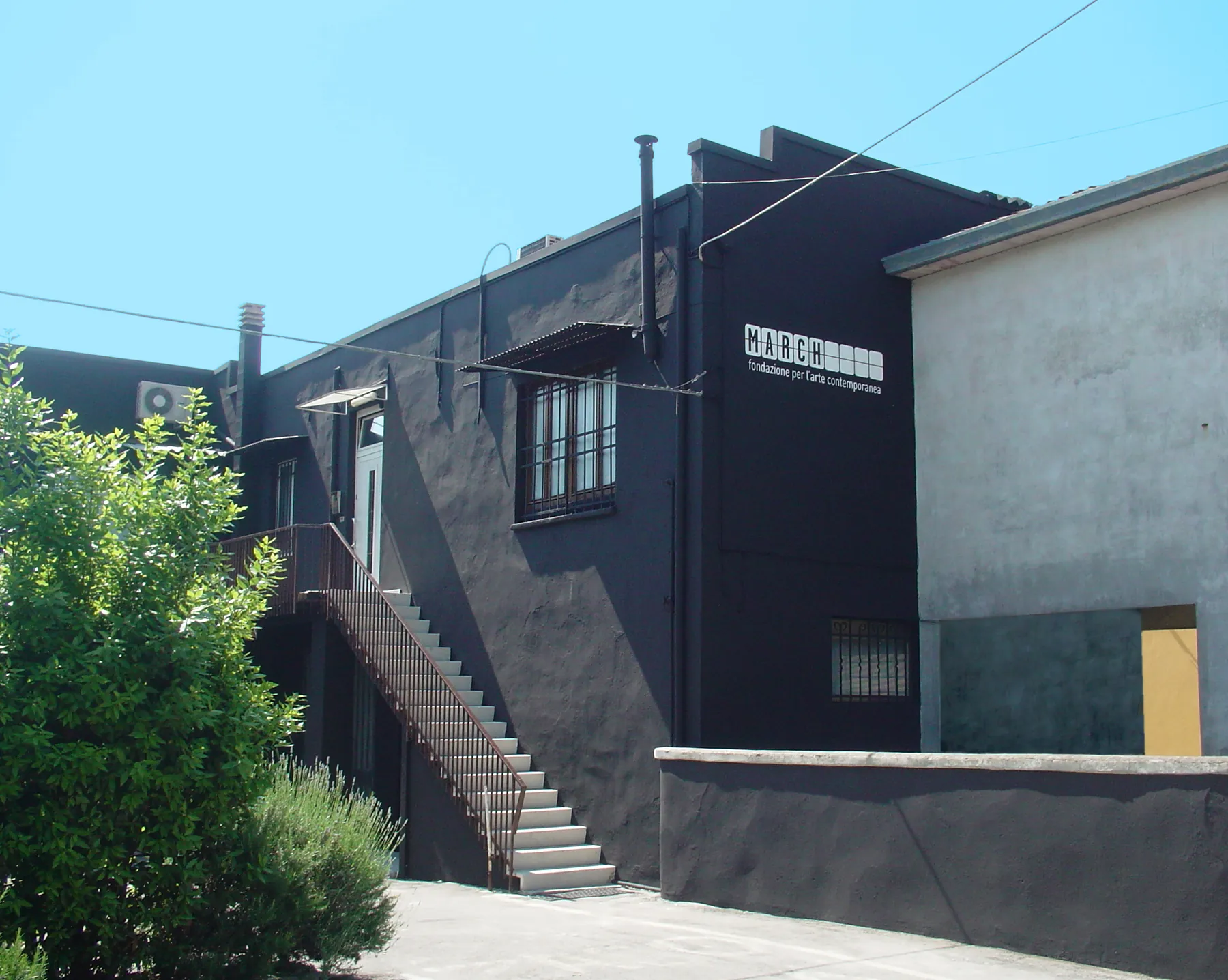
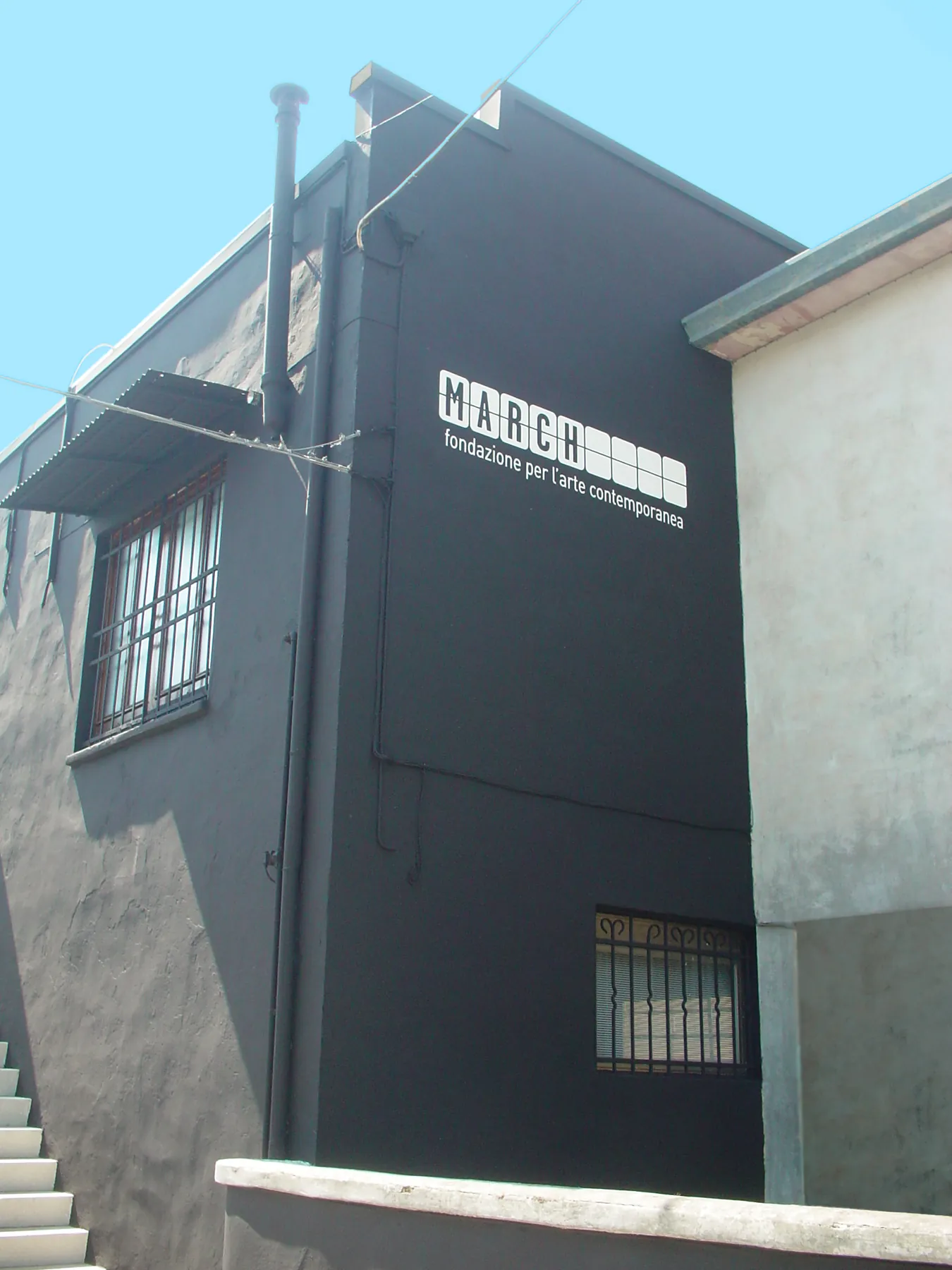
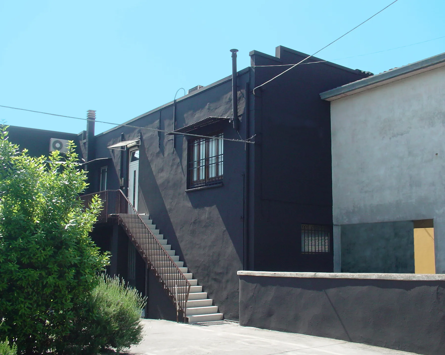
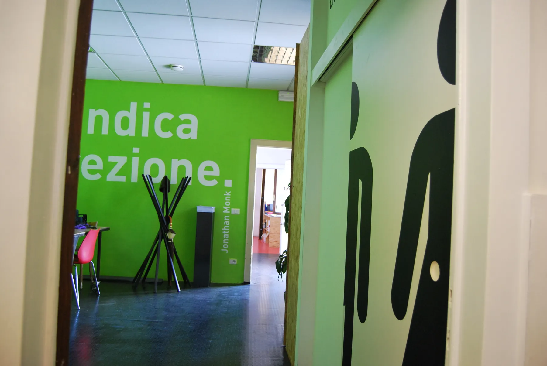
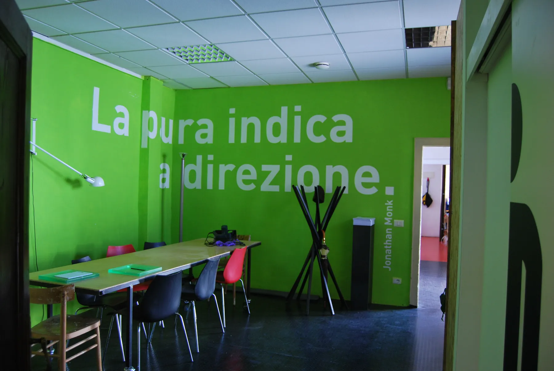
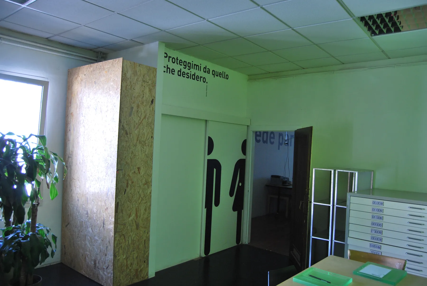
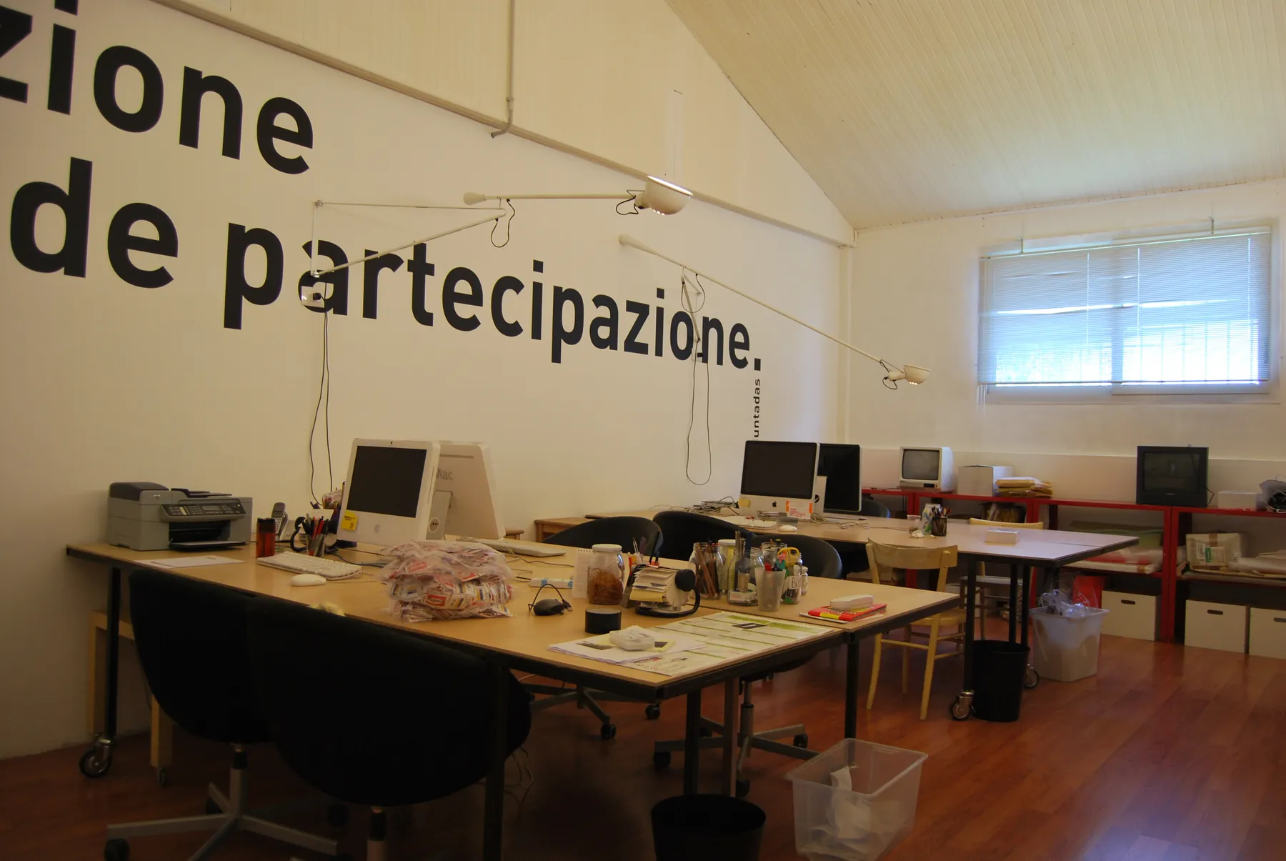
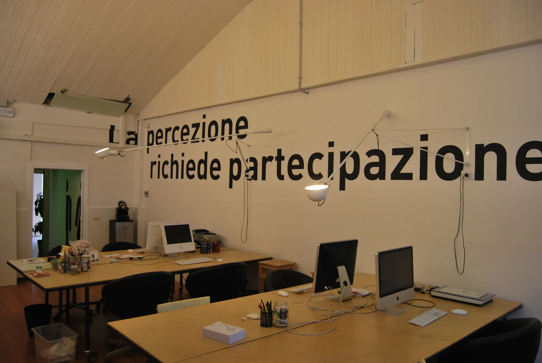
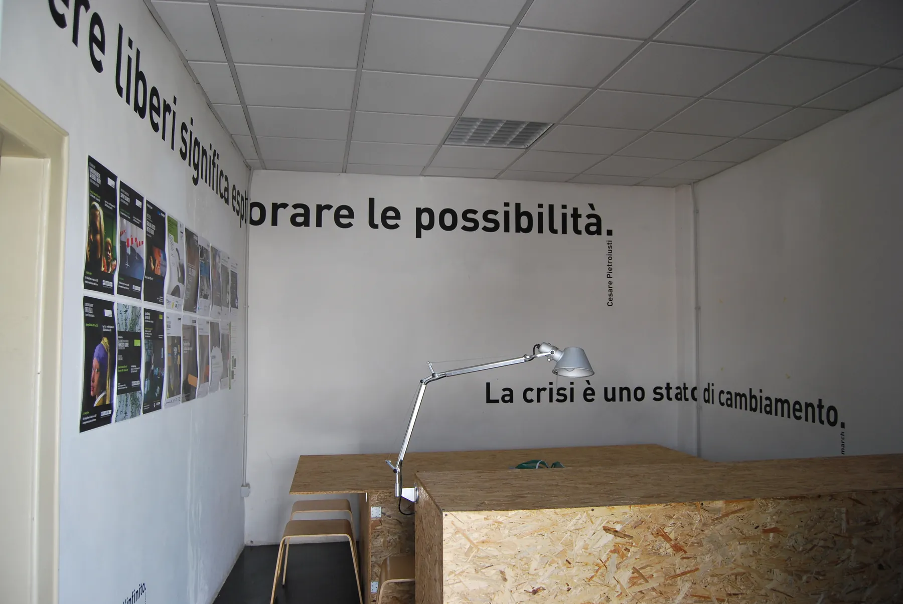
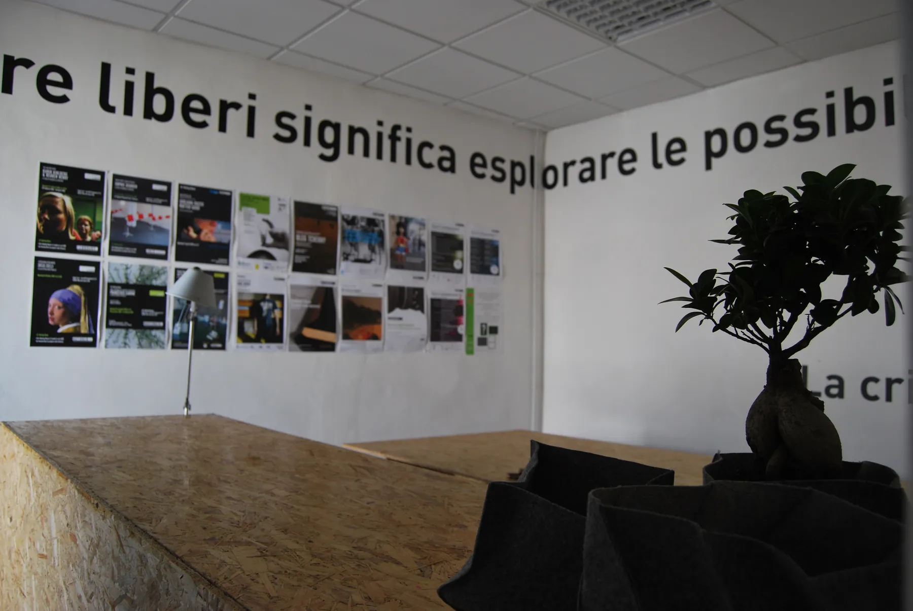
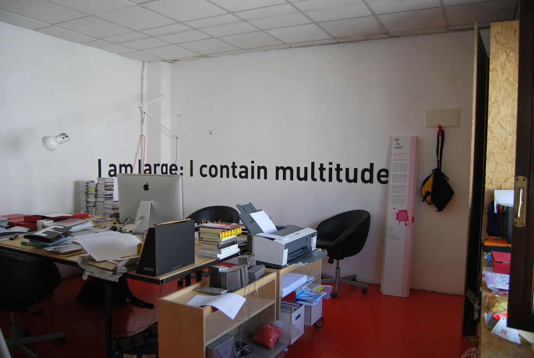
An industrial building at via Armistizio 49, its façade painted black, with the word MARCH. Inside, a system of pictograms built on the tile and large sentences on the walls: “Perception requires participation”, “Being free means exploring possibilities”, “Crisis is a state of change”.
The book
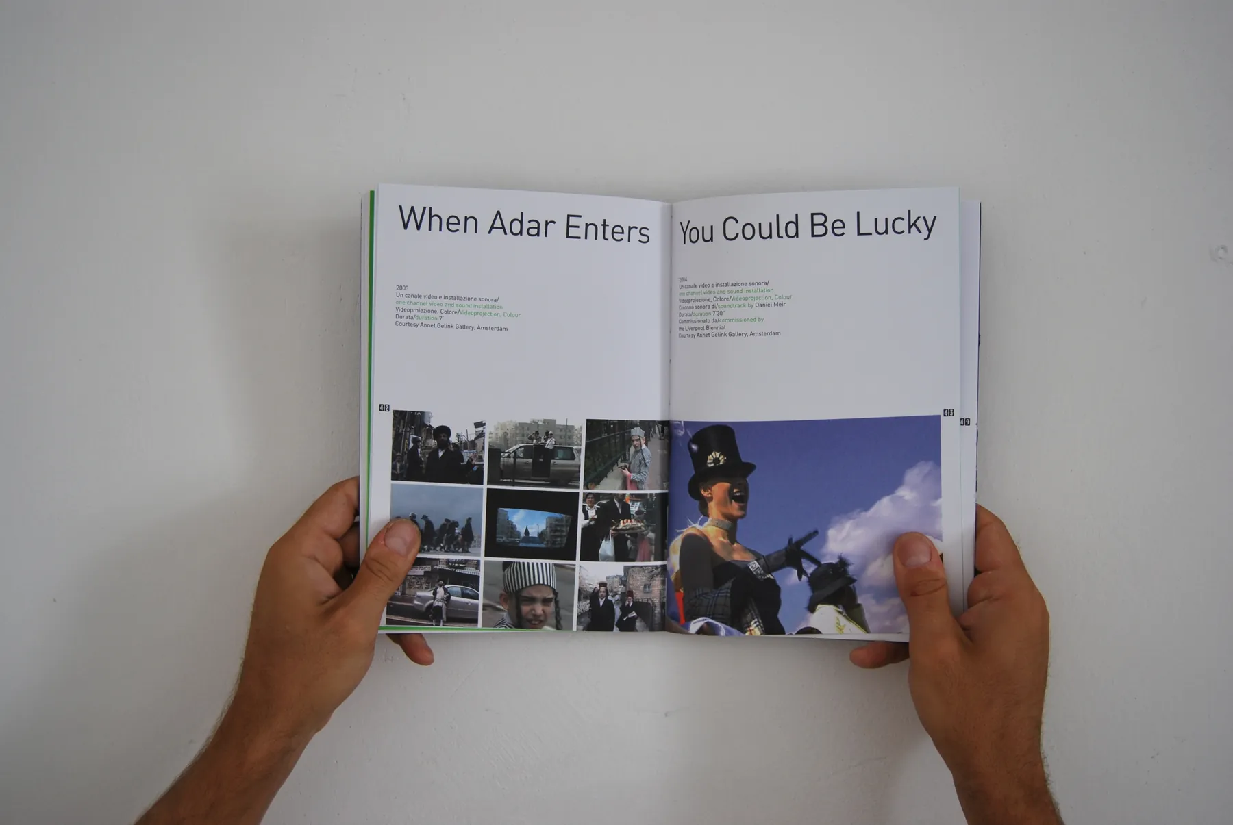
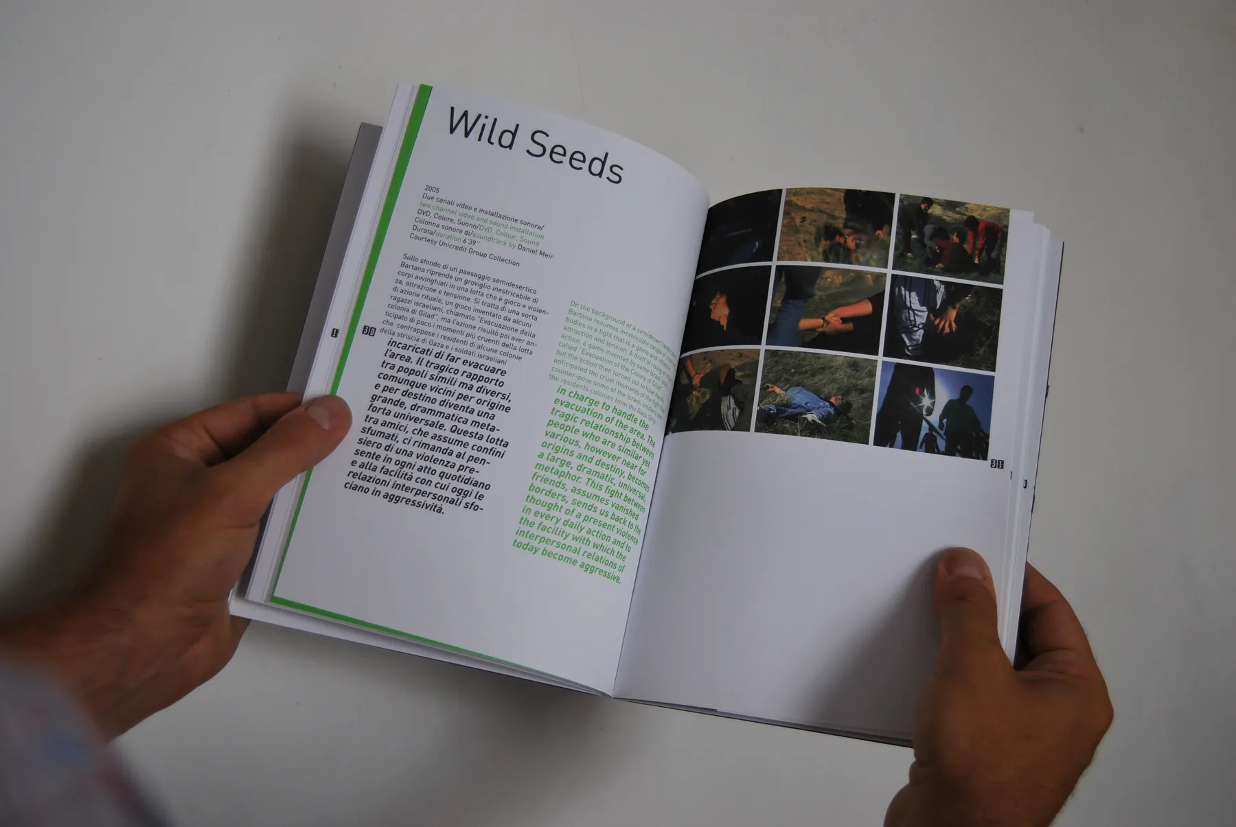
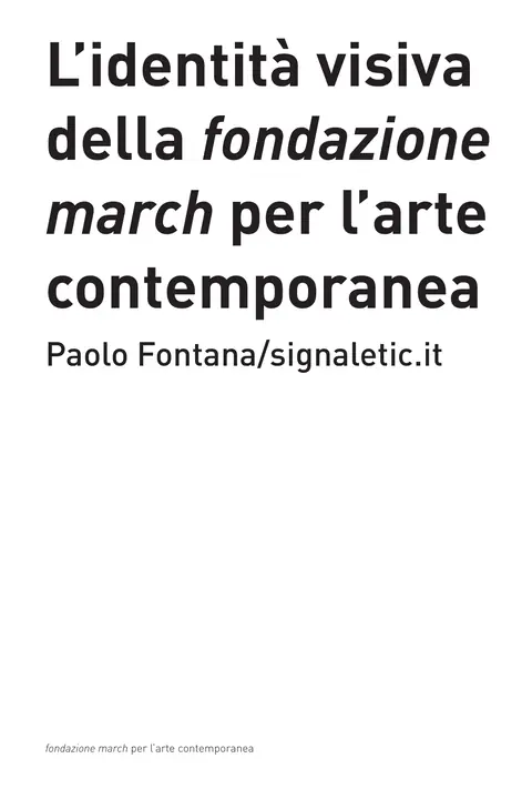
“L’identità visiva della fondazione march per l’arte contemporanea” (The visual identity of fondazione march), Paolo Fontana / signaletic, 2008. ISBN 978-88-903718-2-0. From the introduction to the correspondence with Monk, from the usage rules to the materials, gadgets and signage.